THE JOURNAL

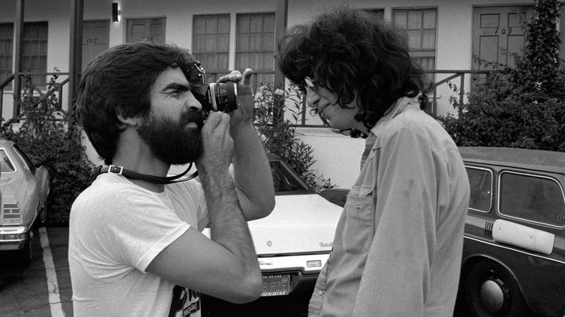
Mr Steve Samiof photographs Mr Joey Ramone of the Ramones at the Tropicana Motel, 1977. Photograph by by Ms Melanie Nissen
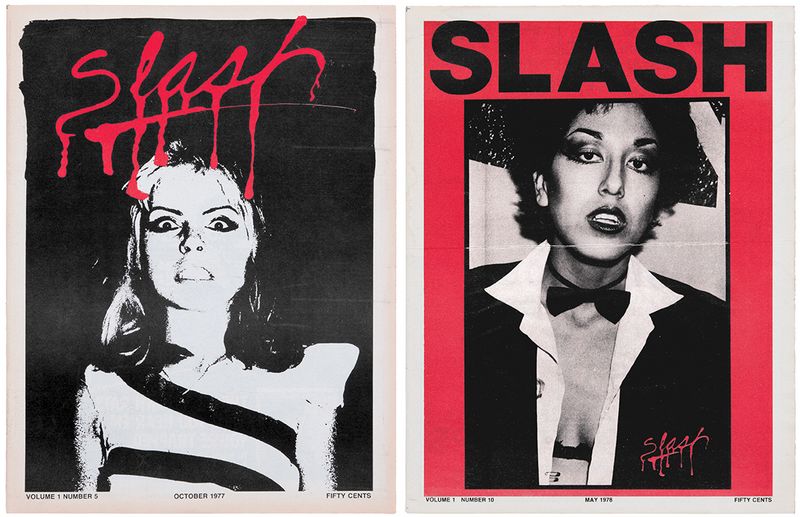
With its unforgettable, etched-in-blood logo, exhilarating photography and snotty, expletive-strewn prose, Slash magazine was the printed embodiment of the fledgling LA Punk scene during its short publication run from 1977-1980. Created by Mr Steve Samiof, then working in local newspapers, and photographer Ms Melanie Nissen in a matter of weeks and printed cheaply on newsprint, it was very much a DIY project. Yet today it looks incredible, with its illustrated headlines and messy, photocopied layouts – and it remains one of the best documents of the era. This, of course, was a particularly exciting time in which bands had names such as Germs and Screamers, and acted – and dressed – accordingly. The images, and words, reflect that. In the second issue of Slash, the interviewer asks a member of American-punk rock-and-roll band The Weirdos how he put his look together. His answer? “I was in a car accident.”
In tribute to the lasting legacy of the magazine, and its status as a cultural artefact, editors Messrs JC Gabel and Brian Roettinger have created an epic new 500-page art book, Slash: A Punk Magazine From Los Angeles, 1977-80 (Hat & Beard Press), which is available now. Collecting many of Slash’s most vibrant spreads, alongside essays from key contributors, it’s a must for anyone who’s interested in music, graphic design or magazines themselves. For the lattermost of the bunch, we got in touch with Slash founder Mr Samiof, now living in Costa Rica, to ask a few questions about how he launched the thing in the first place. Scroll down for the interview.

Left: Slash Vol. 1, Issue 5 (Ms Debbie Harry). Right: Slash Vol. 1, Issue 10 (Ms Alice Bag). Courtesy of Hat & Beard Press
___
What publications and zines inspired you when you first created Slash?
“I’d been thinking about doing some sort of one-off photozine for a while, and then I read an NME article about the Pistols, and the two things kind of gelled. Andy Warhol’s interview was an inspiration format-wise, but books on Dadaists and Situationists, as well as art books and gallery catalogs, were the main aesthetic inspiration.”
___
What’s more important in a magazine, the look of it or the words?
“As a fledgling graphic designer, the look, for me, was the thing. Lots of white space, full-page, uncropped photos revealing rough edges and film sprocket holes, letter-spaced headlines, sans serif captions/body copy… That was my style agenda, anyway. But the power of the printed word was a powerful foe.”
___
Where did the tone of voice come from?
“The primary voice belonged to Claude Bessy. As casual friends, we got together when Slash was in its formative stage, and I explained as best I could what I was thinking of doing. He’d printed a few issues of a reggae fanzine that I’d read, and I liked his attitude. There was a book (his/mine?) at our meeting, of Situationist posters, and one of them said, ‘Be reasonable, demand the impossible’. I don’t remember much else, but we agreed that was our goal, and that set the tone for the mag.”
___
How did you come up with the trademark Slash script?
“Using an ink stopper from a bottle of Pelikan Fount India Ink (on a brown paper bag). I wanted the logo to be cursive, the drippy part was just luck. The naming took an hour of discussion; the logo took about a minute. First try.”
___