THE JOURNAL

How the imagery of a jazz label that hit its stride in the late 1950s remains a beacon of cool today.
“You know, I spoke to somebody at Details magazine who told me that, in the 1990s, they completely restyled the magazine to capture the Blue Note look. That’s how pervasive the power of those images were.” Those are the words of Blue Note Records’ current president Mr Don Was. Mr Was (born Donald Fagenson in 1952) has enjoyed a protean career in the arts. In the late 1970s, he co-founded the proto-art/ funk band Was (Not Was). As a Grammy-winning producer, he’s worked with Mr Bob Dylan and turned Ms Bonnie Raitt into a pop star with the album Nick of Time. He directed a memorable 1995 biopic about Mr Brian Wilson, Brian Wilson: I Just Wasn’t Made for These Times. And when I caught up with him recently, he was en route to produce a new album with jazz/ funk pioneer Dr Lonnie Liston Smith. In short, his take on the label’s cultural legacy is worth a listen.

Blue Note (the name refers to the musical notes that inhabit the space between jazz and blues) was a label with covers that reflected – in mod, emphatic tones – what you were going to hear: literally a jazzy version of soft sell. Founded in 1939 by Messrs Alfred Lion and Max Margulis, Blue Note initially thrived as a label that embraced all forms of jazz. By the 1950s it had solidified into the home of bebop, and was best known for a star-filled roster that included Mr Art Blakey, who seemed to glower with a cigarette perched on his lower lip on every album cover.
The reason that people still reference its album covers as aesthetic milestones today has to do with the alignment of vision between the entire creative team – be it Messrs Lion or Francis Wolff, who produced some of the artists and photographed many of the covers; or Mr Reid Miles, who did most of the design work. Also integral to this shared vision was Mr Rudy Van Gelder, a former optometrist who became the label’s chief engineer, and ran sessions for cool cats such as Mr Thelonious Monk from his suburban New Jersey recording studio.
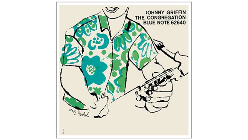
Mr Miles was arguably the most instrumental to the Blue Note look. He began his career as a graphic designer at Esquire magazine in the 1950s, and established a theatrical use of negative space and font that crystallised the spare and suggestive weight of modern art. He put like-minded freelancers to work, as well; Mr Andy Warhol’s sinuous line drawing of a nude in high heels for guitarist Mr Kenny Burrell’s Blue Lights is a glimpse of the future pop art superstar’s talent back when he was still cranking out piece work. (And, in the ultimate irony, Mr Miles was known not to care much about jazz, and gave away or sold his copies of the albums he worked on.)
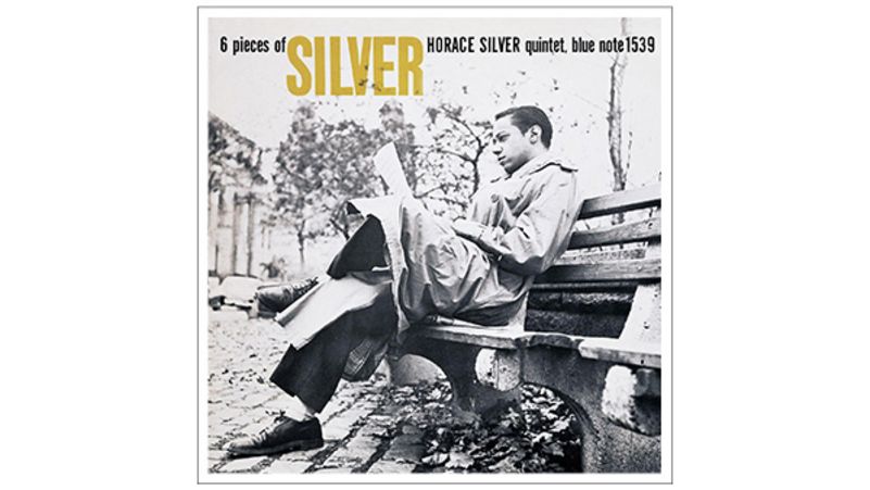
“There was a unity of vision between those guys. They were a team. You got what you saw,” says Mr Was. As he spoke, my head was flooded with Blue Note cover images, such as Mr Horace Silver’s 6 Pieces of Silver, which has the cool-to-the-touch vibe of Messrs Jean-Luc Godard and Silver’s Song for My Father. It’s a statement of art and passion, featuring the pianist’s dad on the cover, leaning back, dressed in his Sunday-in-New-York finest: the best Father’s Day present ever.
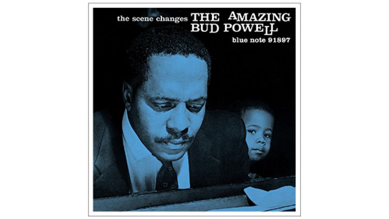
So many of the covers showcased the performers in ways that highlighted their elegance and command, such as Mr Bud Powell’s The Scene Changes from 1958, where the peerless pianist can be seen looming over a piano while a little boy gazes, almost, over Mr Powell’s shoulder – the kid’s not quite big enough for that. (The cover also suggests a future just outside Mr Powell’s periphery, the changing scene of the title.) There’s even the relaxed downtown cool of organist Mr Jimmy Smith – the same photo session was obviously used for Crazy! Baby and Midnight Special, in which he sported a poppy-red long-sleeved polo so bright, it may have had a half-life.
Even then, there’s the presentational sense – musicians outfitted in garments, often suits and ties – that said these are grown-ass men, professionals who take their work seriously enough to dress like adults. And there’s the OG hipster dazzle of black men who understand glamour – at a time when photos of African American men with the world on a string was a political statement when you consider that, during the same era, Motown was said to be uneasy about putting its artists on the company’s albums.
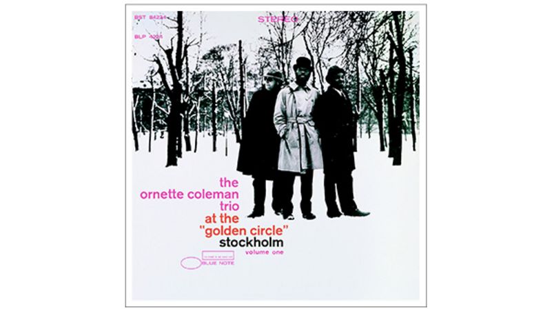
“When I was a kid, the coolest thing I ever saw was Mr Ornette Coleman’s At the ‘Golden Circle’ album,” says Mr Was of the avant-garde saxophonist’s 1965 live recording from a Stockholm nightclub. “I was 14 years old, in the suburbs of Detroit, and I made my mum go out and get me the same outfit. I wanted that trench coat, man! All the other kids my age were wandering around trying to look like The Beatles, and there was I, dressed like Ornette.”
He laughs, and after a pause, reflects, “I’m not entirely sure I was able to pull it off.”
The Blue Note covers created a rarified world, one that offered secrets to a kind of life you’d never before glimpsed. And, oddly, for the most part the sheer, potent drama was communicated through black and white photography, be it trumpeter Mr Donald Byrd posing behind a Jaguar E-Type, a tumescent sheath of Sheffield steel on 1963’s A New Perspective, or 1961’s The Cat Walk, where he’s perched on the hood of an equally mouth-watering Jag.
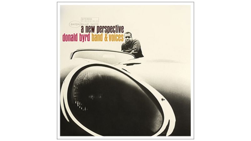
Mr Byrd was a celebrated auto enthusiast – he counselled fellow Blue Note artist Mr Herbie Hancock to buy an early Mustang Cobra, with the result being that Mr Hancock became one of the longest-known owners of Ford’s specialised muscle cars. Mr Hancock’s early band leader, Mr Miles Davis, also recorded on Blue Note – you can find Mr Davis resplendent in a rollneck on the cover of Miles Davis: The Blue Note Years for all your Mr Davis/ Blue Note needs.
There was sometimes a glimpse of colour on the albums: on The Cat Walk, Mr Byrd can be seen through a splash of red. But, often as not, the punch of “white space”– a frosty clean – was part of the cover, as with Mr Freddie Hubbard’s 1962 Hub-Tones, which simulates a keyboard with nine vertical black bars and a photo of the trumpeter, bathed in red, captured on one of the bars.
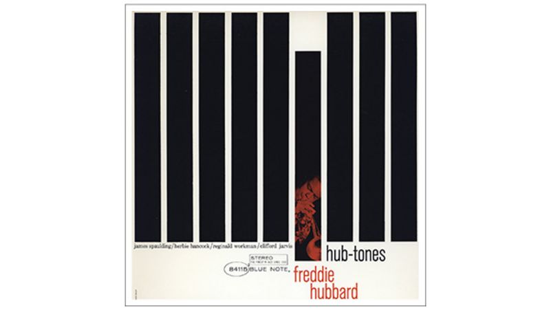
Or, as Mr Was notes, “That’s a great one, too. In fact, the new Mr [Bob] Dylan cover looks like that Hub-Tones thing.” On Mr Dylan’s 2015 album, Shadows in the Night, the singer’s image is broken up in bars, a callback to the mythos created by the photography of Mr Wolff and the graphic design of Mr Miles, as Mr Dylan resides behind a cool, blue tint. “I thought it was a nod to the label, a tacit vote of support.” Though Shadows certainly looks a tribute, Mr Was concedes that he’s yet to speak to Mr Dylan about it. But Mr Was makes a final point about his label’s look: “It’s a part of the culture. That look graduated to billboards and magazine ads. We can’t be territorial about it any more. Blue Note belongs to the culture, now.”