THE JOURNAL

Helvetica Now. Image courtesy of Monotype
“There is no typeface like Helvetica,” says Mr Charles Nix, a man who – having spent the past five years redesigning the iconic 62-year-old font family – is in a good position to judge. As type director at American foundry Monotype, Mr Nix oversaw the recent launch of Helvetica Now, a comprehensive overhaul of a divisive typeface that has inspired documentaries, major exhibitions and no small number of books since being introduced to the world in 1957.
“It’s fraught trying to make a better version of something people are so in love with or hate vehemently,” says Mr Nix. “No other revival has carried the weight that this one did – no matter what we did, we were going to be heavily scrutinised.” First designed by Swiss foundry Haas as an alternative to Akzidenz-Grotesk – the ubiquitous typeface of the time – Helvetica’s stripped-back sans-serif form swiftly became the epitome of neutrality and shaped the logos of a generation of big-hitting brands from American Airlines to The North Face while becoming the default choice for clarity-seeking clients including metro networks, tech giants and government bodies.
So why the redesign? The last time Helvetica was altered was 1983, but, according to Mr Nix, this “workmanlike iteration” saw many subtleties lost in translation. Helvetica Now is an attempt to restore the original nuance of the design, while also addressing very modern challenges. “Back then, it was printed pages and products that dominated, but designers increasingly need to consider how text is viewed on screens of various sizes,” says Mr Nix. “If I’m speaking to you as a brand today, that’s via your laptop, your phone, your watch, subway ads or 300-ft tall billboards in Times Square. There are so many touchpoints and that needs a more robust family of typefaces.”
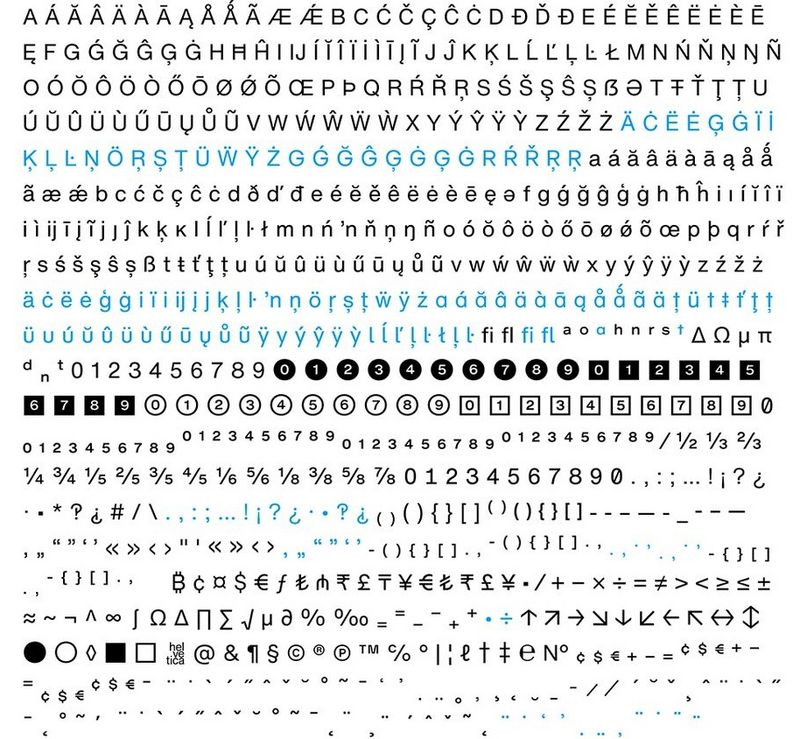
According to influential German typographer Mr Erik Spiekermann, Helvetica Now is a significant improvement. “After 60 years, even the original neutral Swiss typeface had become messy with lots of uncoordinated weights and versions not really suited for small sizes, especially on screens,” he says. “Now there are specific versions for specific sizes and a larger character set with alternative shapes for several characters.”

Helvetica Now glyph set. Image courtesy of Monotype
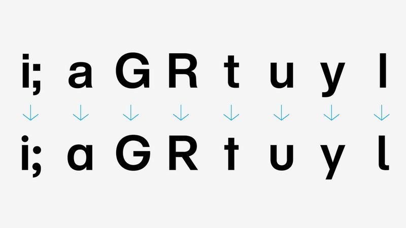
“The straight-legged capital R is a gamechanger,” adds a proud Mr Nix on his introduction of alternative forms. “Likewise the capital G without a ‘beard’ or the single-storey lower-case A – these have all been added to the palette of possibilities, providing a completely different feeling to the typeface.”
Yet a further challenge lies in Helvetica’s ubiquity. Its widespread use as an expression of minimalism has seen it lose its lustre and – despite the neutrality it’s renowned for – some feel it has dated. Like the Emigre typefaces of the 1990s or the ITC typefaces of the 1970s, Helvetica has become a clear stylistic marker of its time. Many big corporations that previously used the typeface are now opting instead for bespoke font families. The BBC announced its shift to its own custom typeface last year, citing a need for a stronger, more unique identity while cutting costs on third-party licences. “Commissioning a custom typeface offers full control over the look and feel of a brand’s typography,” says Mr Stuart Brown of London foundry Dalton Maag, which created the BBC’s new Reith typeface. “A brand font can be a valuable asset in conveying a distinct visual identity across all written communications and formats.”
Helvetica’s cultural clout may wax and wane, but new devotees keep on coming. Directional streetwear label Off-White roots its graphic aesthetic in the use of Helvetica with founder Mr Virgil Abloh – a self-confessed fan of modernism – hailing the typeface’s unifying qualities. Meanwhile a series of other fashion brands – from Burberry and SAINT LAURENT to Diane von Furstenberg – have pared back their identities in recent years, opting for sans-serif logos that, although bespoke, mimic Helvetica’s clean, minimal aesthetic. “Helvetica is not for everyone,” says Mr Nix, before reconsidering his words. “Actually, it _is _for everyone – eventually. Some will move on, some will return, but every designer has to go through their Helvetica phase.”
And according to Mr Spiekermann, this new evolution will guarantee its continued cultural importance. “Bland will always be successful. Helvetica is the vanilla of ice creams and the manila of envelopes,” he says. “While Helvetica Now is not quite wholegrain, it at least has more bite than the previous white-bread versions. And it certainly has the muscle to make Arial go away. And that alone justifies its existence.”