THE JOURNAL

What do the numbers on a Margiela label mean? How did Maison Kitsuné get so foxy?.
As any overpaid, overcaffeinated marketing guru will tell you, a good logo is a powerful thing. What would Batman be without the bat symbol? Superman without the “S”? And if a logo can transform a man wearing his underpants on the outside into a superhero, imagine what it can do for a brand. It has the power to send a message. To seep into the collective unconscious. To distil a company and everything it stands for down into one single, simple symbol.
Little wonder that big businesses spend so much money on getting them right. Think of Pepsi, who in 2008 splashed an estimated $1m on a new logo that looks to all intents and purposes the same as the old one. Or London 2012, whose £400,000 logo was compared to Lisa Simpson performing a lewd act. (Don’t ask. Just google.) But for every logo dreamt up in the lab with a six-figure price tag, there’s one scrawled onto the back of a napkin that winds up being just as successful. A logo can tell you a lot about a brand – but sometimes, the story behind it can tell you even more. We’ve picked out some of our favourites.

MAISON MARGIELA
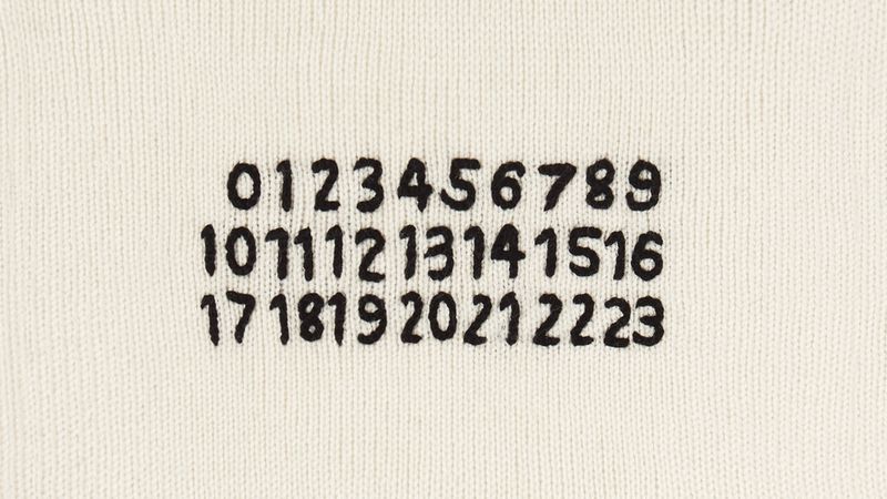
Like the man himself, the logo of the hermetic Mr Martin Margiela’s namesake brand doesn’t give much away. Nothing more than a plain, three-by-eight grid showing the numbers zero to 23, it has been described by its creator as “a proclamation of anonymity”, while the distinctive white stitches that hold the labels in place inside garments were apparently designed to be easily unpicked, “thus rendering the item unidentifiable”. Sure. Time for a quick straw poll – hands up who picks the stitches out of their Margiela sweaters. Anyone? No? Didn’t think so.
What Maison Margiela has achieved by rejecting traditional fashion industry diktats is the ultimate “anti-brand”, and its logo expresses this perfectly. The numbers zero to 23 are simply designed to represent each of the brand’s specific lines. Zero is the brand’s Artisanal range of upcycled fashion pieces; one is womenswear; three is fragrance; eight is eyewear… we could go on. The ones to remember are menswear (10), accessories (11), objects and publications (13), men’s basics (14) and shoes (22). The relevant number is circled on the label of each garment – thus, on a pair of Margiela sneakers you will find a little circle around the number 22. Oh, and there’s the Replica range, too. Did we mention Replica? Of course, if this all gets a little too confusing, you could do what Maison Margiela wants you to do and just take the labels out. Go on. We dare you.

LACOSTE
Monsieur René Lacoste rose to prominence in the 1920s, back when tennis was a gentleman’s game and the accepted sporting attire was the elegant if impractical combination of white flannel trousers, long-sleeved shirt and V-neck sweater. His solution was to invent the first polo shirt – a garment that has since transcended its sporting origins to secure a spot in the menswear hall of fame. And that wasn’t his only contribution to the game: the inventive Mr Lacoste was also the brains behind the first tennis ball machine and the first metal tennis racket, which he unveiled in 1961. But it was his tenacity on the court rather than his powers of invention off it that earned him the nickname “le Crocodile”.
One – possibly apocryphal – story tells of a bet made in 1923 between Mr Lacoste and his Davis Cup captain, Mr Allan Muhr. After noticing Mr Lacoste admiring an alligator-skin suitcase in a shop window, Mr Muhr told him that he would buy it for him if he could beat his next opponent, the Australian Mr James Anderson. The young Frenchman lost the match, but didn’t go down without a fight. When the story found its way to the ears of the Boston press, they confused alligator with crocodile, reporting it as follows: “he didn’t get his crocodile suitcase, but he fought like a real crocodile”. The nickname stuck, and Mr Lacoste soon took to wearing a spiffy crocodile-embroidered blazer to tournaments. In an era when Mr Roger Federer can’t pick up a trophy without first putting on a Rolex for fear of breaching his sponsorship contract, how wonderful it is to think that such a thing once happened.

BOAST
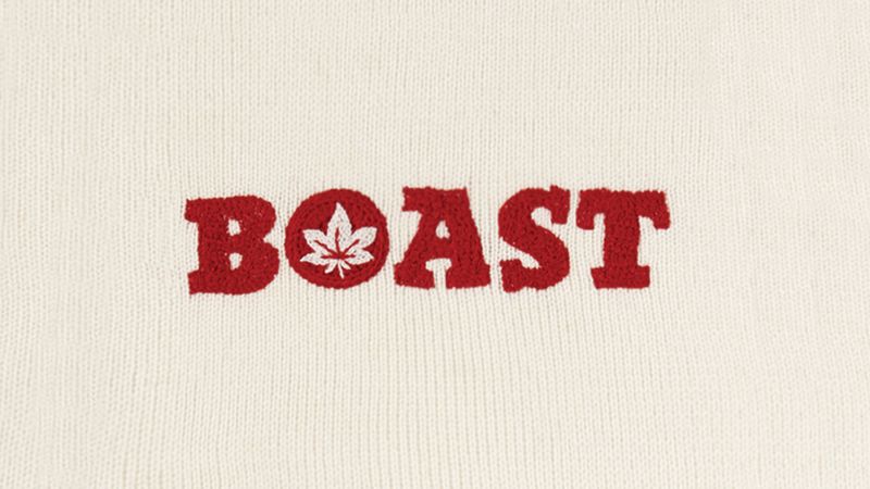
The tennis brand Boast holds a special place in the heart of many a WASPish child of the 1980s. Founded in 1973 by Mr Bill St John, resident pro at the Field Club in Greenwich, Connecticut, Boast had all the ingredients of a cult brand. For one, there was its limited distribution: Mr St John started the business peddling polo shirts to country clubs out of the back of a station wagon. Then there was its underdog status: at a time when European brands Lacoste and Fred Perry were dominating the polo shirt market, Boast offered its American clientele an independent, homegrown alternative. Finally, of course, there was that iconic Japanese maple leaf logo (why, what did you think it was?).
Spurious tales regarding its origins abound. One suggests that Mr St John was inspired by a Japanese kimono maker that used a maple leaf pattern in its designs; another, more vague, story mentions a “trip” taken to the “Far East”. Hey, we’re not judging. But you can’t design a logo that looks like a pot leaf and expect people not to talk about it. This ambiguous logo gave Boast a rebellious edge that chimed well with the big tennis personalities of the era: men such as Messrs Jimmy Connors, John McEnroe and Roscoe Tanner. Soon enough this “country club rebel” look made its way into the mainstream, and the Boast marijua… maple leaf started cropping up in movies (see: Risky Business) and on the chests of men such as author Mr John Updike and even future president Mr George W Bush.
The label faded into obscurity in the 1990s, only to be relaunched in 2010 – with its rebellious spirit and suggestive logo happily still intact. It’s now available on MR PORTER, something that we’re only too happy to boast about.

STARBUCKS
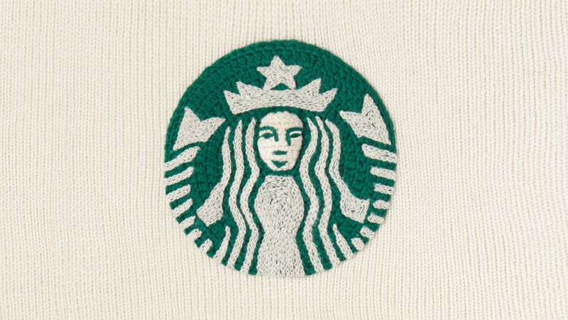
In many ways, the Starbucks brand is a victim of its own success. Ubiquitous to the point of being nigh-on inescapable, it’s become the coffee house that everybody loves to hate. Until we really need a coffee, that is, at which point we just love it. One of the pillars of the brand’s success is its logo, which appears on every single one of the four to five billion cups of coffee it serves per year. If you’ve stepped out of the house at any point in the past three decades, you’ll know exactly what it looks like – but you’d be forgiven for not knowing exactly what it is.
If we’re to believe the official Starbucks historian, the origins of the logo can be traced back to 1971, when the company was still just a small coffee shop operating on the Seattle seafront. Looking for a logo that spoke of the strong connection between coffee and the sea, the company’s founders pored over old marine books and eventually settled on a “16th-century Norse woodcut of a twin-tailed mermaid, or siren”. There was, they claimed, “something about her – a seductive mystery mixed with a nautical theme”.
Or so the story goes. A graduate student in medieval studies at Yale was quick to call it out as bunkum, explaining that there’s no such thing as a 16th-century Norse woodcut – you could have fooled us – and that the original, bare-breasted siren image chosen by Starbucks was in fact lifted straight from Mr JE Cirlot’s A Dictionary of Symbols, the second edition of which was published, coincidentally, in 1971. The Yale student’s blog post makes for fascinating reading. And the take-home message? Never trust Starbucks. Unless, y’know, you really need a coffee.

MAISON KITSUNé
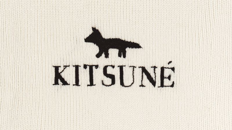
Maison Kitsuné is one of the lesser known brands stocked on MR PORTER, but it’s coveted by those in the know. Kitsuné actually started life in 2002 as a record label before its founders, Messrs Gildas Loaëc and Masaya Kuroki, branched out into clothes. Since then, the Parisian label has earned itself a reputation for upholding the kind of production standards that many lesser brands deem unneccessary. Or, as my esteemed colleague might put it, “it’s proper clobber”.
And to the logo. Most folks can recognise Le Croc and the Polo pony, but there is a knowing insider cool to being able to decode what that little fox is all about. It’s a pretty self-explanatory logo – assuming that your Japanese folklore is up to scratch. Kitsune is the Japanese word for fox, an animal that is portrayed in traditional stories as a magical creature with the ability to change its appearance and even impersonate a human. This shape-shifting quality was what first attracted Messrs Kuroki and Loaëc, who saw in it a reflection of the multifaceted nature of their music-meets-fashion brand.

NIKE
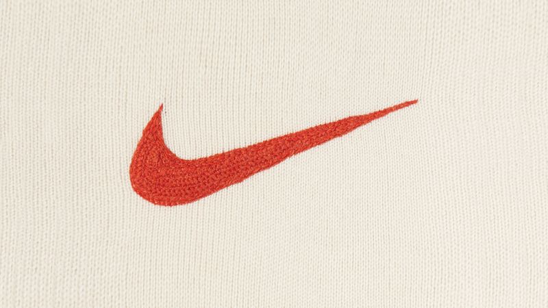
It’s only fitting that a brand as iconic as Nike should have a logo as iconic as the Swoosh. The relationship between brand and logo is so strong that it almost seems wrong to talk about them as separate entities. Nike is the Swoosh; the Swoosh is Nike. “Hold on a moment, Mr P,” we hear you say. “Are you trying to tell us that overpaid, overcaffeinated marketing guru was right all along?” Easy, tiger. Put your cheque book away and listen closely to the story of how the Swoosh came to be.
In 1971, around the time that Mr Phil Knight was in the process of renaming his sneaker import business from Blue Ribbon Sports to Nike, he employed the services of a young design student whom he met while teaching an accounting class at Portland State University. That student, Ms Carolyn Davidson, produced the now iconic design, whose sweeping shape was inspired by the wings of the Greek goddess of victory from which the brand took its name. Ms Davidson’s payment for the job? The sum total of $35. But perhaps more galling than her pittance of a fee was Mr Knight’s decidedly lukewarm assessment of what he had just bought: “I don’t love it, but I think it’ll grow on me.”

APPLE
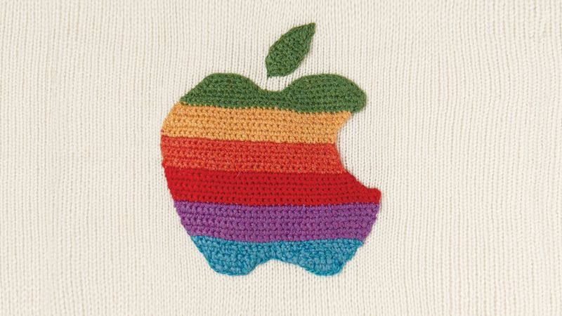
Any brand that attracts as much cultish devotion as Apple is bound to find its logo the subject of much scrutiny – not to mention speculation. Is the “bite” in the apple an allusion to “byte”? Do the logo’s dimensions adhere to the “golden ratio”? (No and no.) One of the most commonly repeated myths concerns the wartime codebreaker Mr Alan Turing.
Though now recognised as the father of modern computing, Mr Turing’s life was one marked by misery. Arrested for homosexual acts in 1952 and facing imprisonment on charges of gross indecency, he accepted a course of chemical castration to “correct” his sexuality. It didn’t last long. He was found dead only two years later; on his bedside table was a half-eaten, cyanide-laced apple. It has been suggested in the years since that the logo Apple employed between 1977 and 1998 was designed in tribute to Mr Turing’s tragic tale: the bitten apple representing his Snow White-inspired suicide, the colours of the rainbow reflecting the freedom he was never granted as a gay man.
The truth, as in most cases, is far more prosaic. Apple’s co-founder, Mr Steve Wozniak, recalled that the name “Apple Computer” was chosen after Mr Steve Jobs returned from an apple farm in Portland, Oregon. And according to the logo’s designer, Mr Rob Janoff, the bite was added merely to make it look more like an apple and less like a cherry. Sorry, Alan.
The Brands
Logos by Ms Kate Jenkins