THE JOURNAL

MR PORTER exhibits some of the most stylish men to attend this year’s Frieze Art Fair.
Since it launched in 2003, the Frieze Art Fair has become one of the core events of the art calendar, bringing a deluge of visitors to London every year to discover the very best contemporary art from around the world. This year, as ever, it was a much-buzzed success, with 164 galleries from 27 countries participating, queues stretching into the distance for the 11.00am preview session and headline-grabbing activities, including a caricature stand run by Japanese artist Mr Ken Kagami (the catch being that Mr Kagami’s caricatures were of sitters’ genitals, or at least, how he imagined them).
At MR PORTER, of course, we are always interested, if pleasantly bemused, by such goings on, but we’re also particularly fond of Frieze because its attendees tend to be so well dressed. The art world, it seems, has its own sartorial rules, and they are rather good, involving deft use of colour and admirable understatement as well as, we can only assume, a certain amount of intellectual and conceptual rigour. Scroll down to discover a few of the most thought-provoking dressers we spotted at this year’s edition, and glean a few tips on how to get that “I like the early work” look yourself.
CHOOSE YOUR PALETTE WISELY

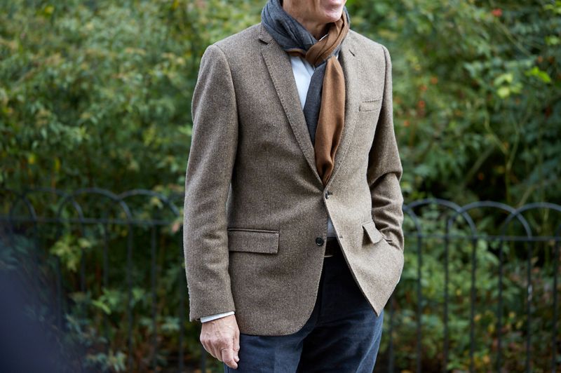
This Frieze attendee, who, judging from the pristine state of his clothing, is probably in the market for some sort of tasteful, geometric abstract painting, is a living version of a lesson that we at MR PORTER often find ourselves repeating: choose two main colours and keep to them. Here he’s gone for a bright amber sweater (complemented by stone chinos, which, though not identical in hue, are in the yellow-brown-y spectrum), which makes for a warm contrast to his sharp navy coat. The fact that the leaves in Regent’s Park are just the right colour to make this look particularly good is sheer coincidence (we hope).
GET THE LOOK
BE SMART, BUT NOT TOO SMART
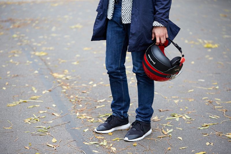
It’s a point of pride within the art community to not look like a “suit”. They are the nebulous beings shovelling around disgusting amounts of money in order to decorate their yachts. You are a consummate connoisseur of the contemporary arena, deeply engaged with the way in which the work handles questions of genre, or notions of representation, or, indeed, engagement itself (the italics here denote the significant look you give everyone when you say this). It’s therefore important to dress on the casual side of smart, with a dash of bohemian flair for good measure. The above outfit ticks all three intertwining boxes, thanks to the slightly weathered look of the moleskin trousers and the jauntiness of the scarf, tied in a Parisian knot.
GET THE LOOK
HAVE A BLUE PERIOD
As far as colours go, blue is one of the more artsy. Mr Yves Klein, one of the most daring artists of the early 20th century, was so obsessed with the colour that he invented his own shade of it – International Klein Blue – in the late 1950s, and proceeded to daub it over everything he could think of in a series of monochrome artworks. We can’t vouch for the fact that this fast and furious art lover was thinking of this when he put together the above look, which matches the overdyed blue of indigo denim with a deep-blue coat, but we can approve the final result – a total immersion in blue, only slightly interrupted by the dense patterned blazer he wears underneath.
GET THE LOOK
PAY ATTENTION TO YOUR SOCKS
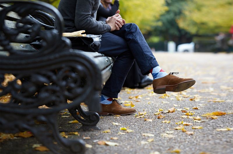
The Frieze Art Fair is one of the calendar fixtures that reminds us that autumn is here. Which means, gentlemen (and this is something of a personal plea in addition to a style tip), it’s time to put some socks on. Yes, it’s been fun over the summer seeing everyone’s ankles poking out of their Stan Smiths, but now it’s October, it’s far more discreet and elegant to make like the man above and cover up those knobbly extremities with an attractive pattern. This pair works particularly well, not just because the rest of the outfit is very plain, but because it complements the blue of the chinos.
Get the look
PULL OFF A PATTERN
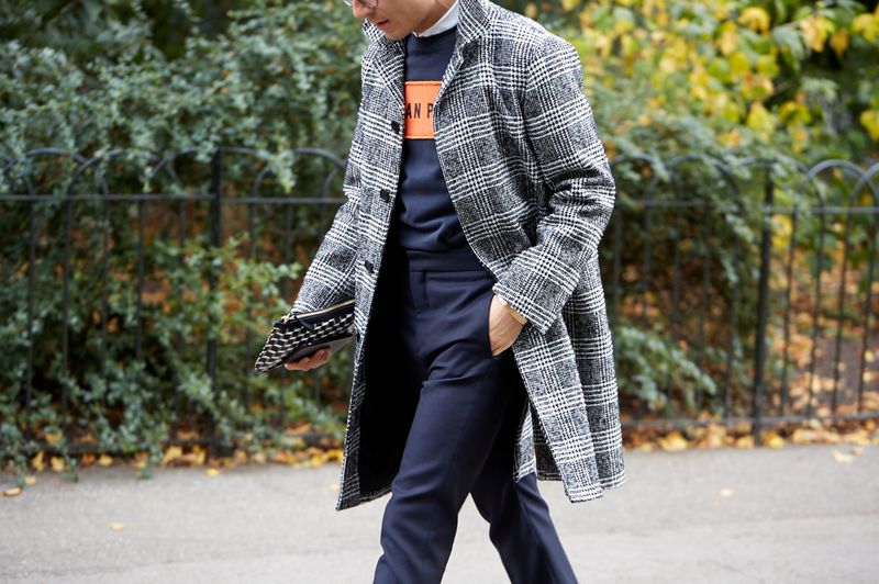
One of the ideas that’s being chewed over by many menswear brands is traditional menswear patterns, such as hound’s-tooth, tartan and Prince of Wales check. This is not always the easiest thing to wear, especially in the case of an attention-grabbing check coat, but the gentleman above demonstrates exactly how it should be done – ie, with confidence. By restricting himself to a striking navy in his trousers and sweater, he shows off the coat’s pattern without letting it overwhelm him. The orange chest panel gives the whole thing a touch of edginess, but if you were aiming for a more traditional look, a plain navy jacket or cashmere sweater would work just as well.
GET THE LOOK
PILE IT ON
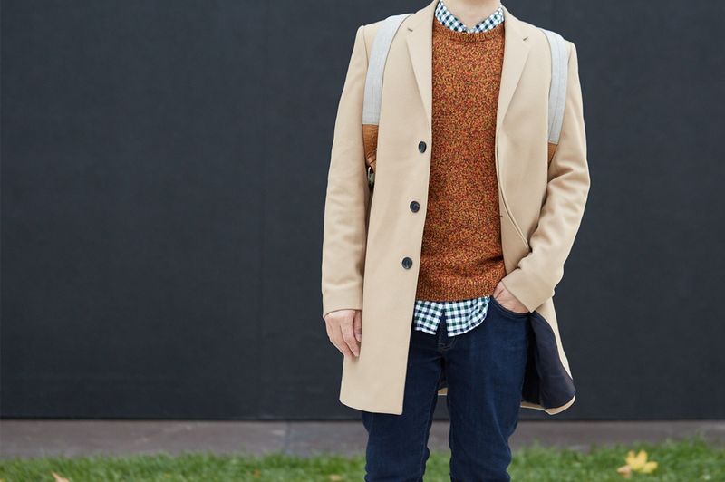
What’s particularly impressive about this outfit is that there are so many different elements to it, yet it all comes together harmoniously. The key to its success is the same two-colour rule mentioned at the top of this page (the axis here is blue/ black vs beige/ tan), but also the way in which each piece has its own distinct texture. The jacket has a crisp, matt surface that contrasts pleasingly with the rough marl look of the sweater. This in turn stands out against the graphic check of the shirt and the more subtly faded colour of indigo denim underneath. We can only speculate in which area of the art world this fellow finds gainful employment, but he certainly is an expert in getting dressed.