THE JOURNAL

All posters by Mr Milton Glaser, courtesy of Abrams
You may or may not know Mr Milton Glaser’s name, but you will certainly know his work. I ♥ NY, that iconic, simple design that has been appropriated countless times? That was Mr Glaser. The graphic psychedelic poster of Mr Bob Dylan with flames of colour bursting from his head, one of the defining images of the late 1960s? Mr Glaser again. New York Magazine? Mr Glaser co-founded it. A wildly prolific graphic designer, the New York native has created some of the best-known commercial imagery ever, and is one of the most revered names in the design industry.
Mr Glaser, 88, hasn’t retired and continues to produce work today. Now, he has released a retrospective book documenting some of his most fascinating poster work. “I’ve been doing posters for 50 years or so and they represent a significant part of my work,” says Mr Glaser. “I sent a dummy [mock-up] to a publisher I admired and they immediately said OK, which is rare these days, and the rest is history.” Indeed, much of Milton Glaser Posters is a reflection of history. Mr Glaser worked through the golden age of advertising in the Mad Men era and his book celebrates the talent that came out of New York in the 20th century.
Today, though, Mr Glaser says New York has lost some of the magic it once had. “The sense of optimism, that anything can happen, has been damaged by the economy and the expense of living in the city – like other parts of America,” he says. “Economic differences have made people feel separate from each other and concerned about their own survival.” Still, the designer remains optimistic about the next generation. “The best design work I’ve seen recently was at the young people’s march to control gun violence in America,” he says.
When it comes to contemporary graphic design, Mr Glaser says that even with the advent of the internet and the disruption it has caused to print, the challenges designers face are still the same. “The problems that graphic designers face today are the same problems that have always existed in the graphic arts,” he says. “How do you make people pay attention to anything?”
Below, Mr Glaser picks out three works from the book, and explains the stories behind them.

The Gallery at Lincoln Center (1990)
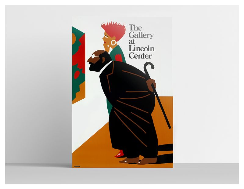
Client: Lincoln Center For The Performing Arts
“Two possible kinds of visitors, the trendy and the scholarly, are depicted in this poster for Lincoln Center.”

I Love NY More Than Ever (2001)
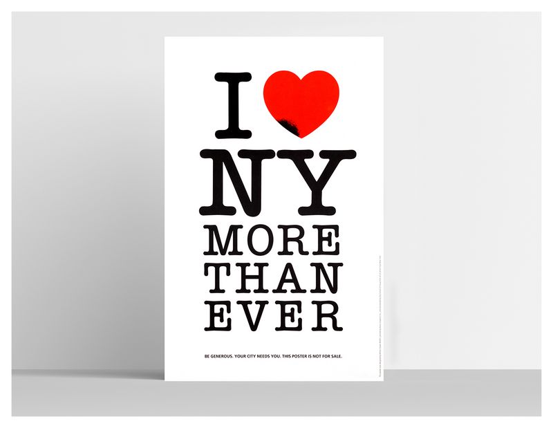
Client: School Of Visual Arts
“This was my response to the events of September 11, 2001. It was posted all over the city by students from the School Of Visual Arts and accurately reflected the feelings of most New Yorkers in response to that horrifying day. A bureaucrat from the state called me and said they would like to use the image but without the black mark on the heart. When I told him that that was the point of the poster, he threatened to sue me for being in violation of the state’s I ♥ NY logo. When I responded that I designed that logo, he said, ‘That’s why you should know better.’ I sent a note to the governor, the mayor and The New York Times. Two days later, the bureaucrat called back to suggest that we simply drop the matter.”

Pasta Furniture (2006)
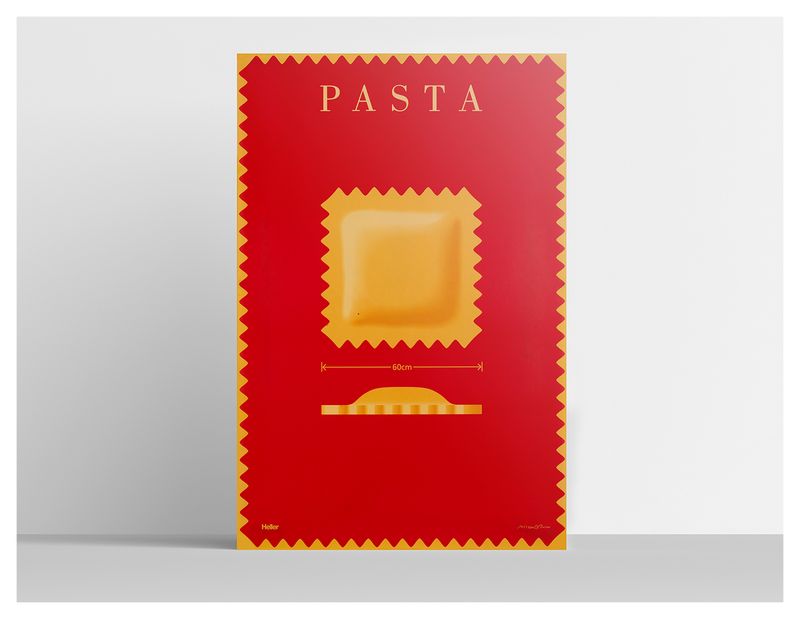
Client: Heller
“This poster was designed for the furniture manufacturer Heller as an introduction to its line of plastic, pasta-shaped pillows. The only clue that we are not talking about edible pasta is the measurement indicating that it is 60cm wide, a mouthful even for ravioli lovers. The dimension wasn’t sufficiently visible, so almost all viewers think this is an ad for an unknown pasta maker.”