THE JOURNAL

Five heavyweights of graphic design and visual communication weigh in on that holiest of grails: the perfect typeface .
In September 2013, academics at the University of Oxford published a report detailing the likelihood that robots will take over your job. Real estate brokers, credit experts and models (upsetting, we know) are among the professions that will be thrown on the scrapheap of history. Sorry. But, on the other hand, it looks as if we’re always going to need good visual communicators – the title of “art director” is 95th least likely to succumb to the singularity, while “graphic designer” is 161st, out of 700 professions surveyed.
This isn’t surprising. As culture becomes more and more image conscious (thanks, Instagram), the people in the business of making things look good on paper (and the rest) matter all the more. And the fundamental qualities that this kind of work demands are very human ones, such as taste, wit, inventiveness, originality – just try making an algorithm that will simulate all that, humans of the future.
In tribute to the “dark art” of good graphics (as Mr Mat Maitland puts it, below), MR PORTER visited the work spaces of five accomplished designers who create within the broad field of “graphic design”. From Mr Chip Kidd (you’ve held a book whose cover he designed) to art director Mr Edwin Van Gelder, we asked each creative to nominate that most graphic-designer-y of things, a favourite font. Read on to discover which one is your type.


While most art schools still offer “graphic design” courses, the classification of those working in the contemporary field of visual communication is not so simple. Mr Maitland, a man whose wide-ranging work amply demonstrates this fact, is both a creative director at Shoreditch-based design consultancy Big Active and a visual artist in his own right. In the latter capacity he has created surreal, collage-based album imagery for the likes of Goldfrapp, Basement Jaxx and Mr Michael Jackson (for 2014’s Xscape), as well as film and motion graphics for fashion clients including Kenzo, Printemps and British outdoor brand Hunter (notably, the eye-popping sub-aquatic visuals at its SS15 runway in London). Mr Maitland’s interest in design was sparked by the covers of records he collected as a teenager, and he’s also a lifelong Prince fan (he designed artwork for the singer’s “Fallinlove2nite” single in 2014 – “a dream come true”). One of his most fondly remembered typefaces, therefore, is Venus SB Medium Extended, as used on the startling, stark cover of Prince and the Revolution’s 1986 album Parade.
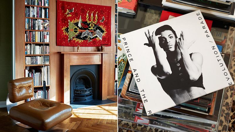
Mr Maitland’s nominated font is Venus SB, as used on the cover of Prince’s Parade album, right. Left: Mr Maitland’s home office in Hampstead, London
What was it about record covers that made you want to be a designer?
Buying records was the first time I was really aware of design. It put it into context as an actual, tangible thing. I still buy records just because of the artwork. Back then, it kind of had a glamour to it, an allure – it was like a “dark art”.
You’ve used collage a lot in your own album cover designs – why?
I guess what I loved about collage was that it was available to anyone. You could get stuff from anywhere and make an image out of it, pulling things from different places. Even typography for me is part of an image, it’s not just a piece of type, it’s how it is in the context of the image.
How do you think the type works on Prince’s Parade cover?
For me, it was a really amazing departure for Prince when that album came out. Because it suddenly presented this sophisticated, stripped-back look. It was all based around the film, Under the Cherry Moon, which had a French Riviera, Art Deco look to it. The typeface, Venus SB, was nice and simple. It’s got that Art Deco touch to it, in the R and the E. I’m a big believer in what’s right for a project, and for a world, and I think that was the perfect style.
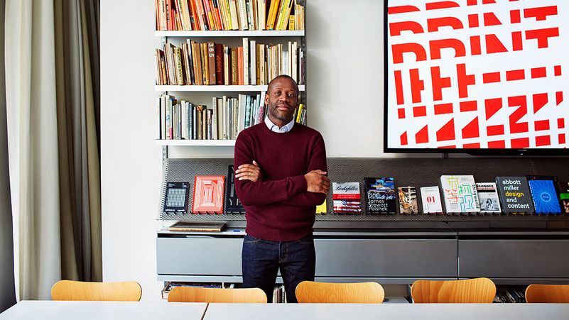

To work at Pentagram, the influential company that has, over four decades of industry-leading work, rebranded Faber & Faber, Sotheby’s and The Guardian to name a few, is a dream for a great many young creatives. But it was never a particular goal for London-born designer Mr Eddie Opara. “It was somewhere where everybody else wanted to work, at school,” he says. “I thought, I’m just doing my own thing.” The “school” in question was Yale, where he came to study for an MFA in 1995 after graduating from the London College of Printing. His “own thing” turned out to comprise stints at New York studios including 2 x 4, the founding of his own company, the Map Office, in 2005 and the scooping of multiple design awards for his work. But fate, it seemed, intervened – Mr Opara was made a Pentagram partner in 2010 after delivering a particularly inspiring lecture at the firm’s offices in New York. A true multi-disciplinarian who works across print, digital, environmental and identity design (most notably for the 2014 rebrand of the Cooper Hewitt museum), Mr Opara is as happy working with interactive infographics (see his “social polling” platform Blopboard), as he is designing books. (He’s starting to write too, his first opus being the instructional manual Color Works.) His favourite typeface is Albertus, a font designed for the Monotype Coporation in 1932 by German ex-metalworker Mr Berthold Wolpe.
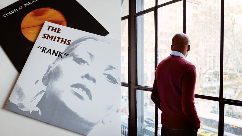
Mr Opara’s nominated font is Albertus, as seen, left, on the cover of The Smiths’ Rank and Coldplay’s Parachutes
What inspired you to work in design?
When I was a teenager I designed a logo for one of my mum’s women’s associations – she was my first client. I think that’s when I first thought I wanted to be a designer. I didn’t know what kind. I even contemplated architecture until a mate in art class said that the way I painted was like Cézanne, but too geometric. My apples were way too round. Then he said, you know what, you should be a graphic designer.
When did you first encounter the Albertus typeface?
On the street signs in the City of London. I didn’t know what the font was until I got to design school. And I was so fascinated by it because of the way it’s cut. It’s based on metal engraving techniques, the effect being that it has is these acute angles, almost 45 degree angles in each letter. It’s also insanely hard to use. I’ve tried to use it and I’ve not been able to. Why is it my favourite font, then? I think that your favourite is always what you can’t have.
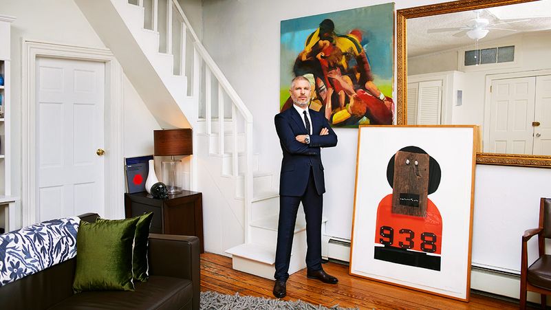

In today’s working world people tend to progress their careers by zigzagging between jobs at different companies. But it doesn’t have to be that way. Israeli-born designer and Cooper Union alumnus Mr Sagi Haviv of corporate identity gurus Chermayeff & Geismar & Haviv entered the firm (then Chermayeff & Geismar Inc.) in 2003 as an intern. Now he’s a partner. Since his appointment in 2005 (and the consequent update of the office stationery in 2013) he’s worked on an equal footing with founders, Messrs Ivan Chermayeff and Tom Geismar – the men behind logos for Mobil, NBC, Pan Am, the Chase bank and MoMA – to create more than 50 new identities for the likes of Conservation International and the Library of Congress, giving these brands clarity and distinction in the information-wracked world of the 2010s. One of the fonts he’s had the most fun with recently is Palatino, which he employed for the bold, simple rebranding of the Harvard University Press in 2013.
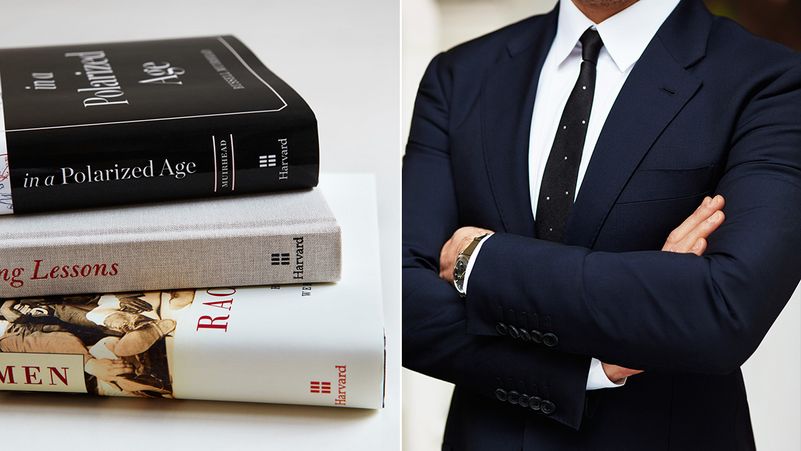
Mr Haviv’s nominated font is Palatino, as used in his new logo for the Harvard University Press, stamped on the spine of the books, left
What makes a perfect trademark?
There are many misconceptions about logos, especially what they can and can’t do for a company. A logo can’t tell a whole story – in fact it can say very little. What we often remind clients (and ourselves), is that we’re not looking for a message, but for identification. We make a great effort to create original things, The logo isn’t going to change the experience of the brand but, if it’s a good logo, it will remind consumers of that experience.
What was the thinking behind the Harvard University Press logo, and its use of Palatino?
Palatino is actually quite a generic font. When we presented the identity, the people from the press were shocked that we would come in with a font that was available on people’s computers, for this, the most prestigious publisher in the world – how could that be? We made a case for the fact that the word “Harvard”, in upper and lower case, in that font, has a sense of tradition, a hint of the pen nib. The contrast between the geometric symbol and serif font is what makes the magic here. It’s looking to the future, but it’s anchored in tradition.
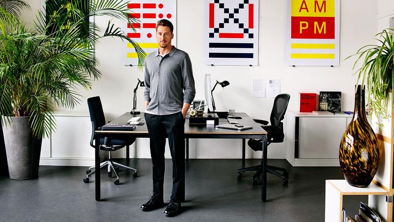

Amsterdam is well known as a place with lots of canals, so perhaps, as they say, there’s something in the water – the city, after all, has spent much of the past half-century churning out talented graphic designers, from Mr Wim Crouwel to anarchic studio Experimental Jetset. Mr Edwin Van Gelder, the founder of Amsterdam-based design practice Mainstudio is one of the most impressive of the current crop, espousing a stripped back, restrained and wonderfully precise aesthetic that was introduced to the world at large when he served as the designer of artsy architecture magazine Mark from 2008-2012. Focusing on editorial design for architects and fine artists (his award-winning design for artist Mr Thomas Raat’s 2012 book An Inquiry Into Meaning and Truth is a must-see), his work has a razor-sharp focus that boils down to a simple formula: the right grid and the right type. But his manipulation of these elements is virtuosic – a case in point being the identity he designed for the IIT College of Architecture, Chicago in 2013. The font he used for this, Theinhardt, has become a firm favourite.
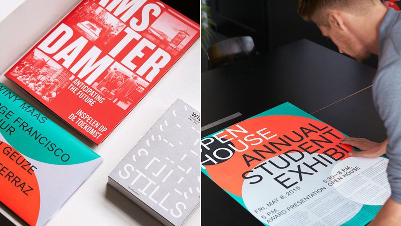
Mr Van Gelder’s nominated font is Theinhardt, as seen on his poster designs for IIT College of Architecture, right
Your work often uses very rigid grids and guides – do you enjoy working within limitations?
Yes – if you work with a set of boundaries, the content makes the design come alive. If you don’t have a restriction, well, anything can happen. It becomes more like an illustration. I prefer to think in systems, more like an architect. When you place type or imagery in a system, it gives the design a rhythm.
What makes a good font?
In my work, I look for timelessness, something that’s not too trendy. Of course a typeface needs to have good spacing and all the technical details correct. But it also needs some element of the future, of newness, of the time we’re living in.
Why are you particularly attached to Theinhardt as a typeface?
It’s based on Grotesk, a classic serif font, but it’s an updated, contemporary and very flexible new take on the classic. I like its overall look and feel – stern yet friendly. It feels very now, very modern. There’s also something architectural about it, it’s got a graphic quality to it, so you can use it to create geometry in a design. It’s not illustrative, not an image itself but it fits really well into grids and systems – which obviously suits the way I work.
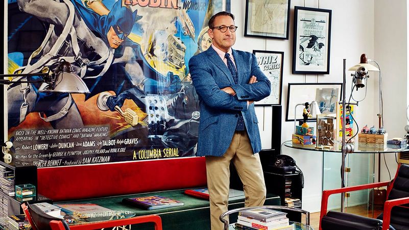

As associate art director at New York-based publishing imprint Knopf, Mr Chip Kidd is one of the world’s most sought-after book designers. In his 29-year career at the company he’s been responsible for a series of unforgettable book jackets, from the silhouetted dinosaur skeleton that covered the original edition of Jurassic Park (and was co-opted into the branding and production design of the 1993 Mr Steven Spielberg movie) to covers for the late Mr John Updike (who has called Mr Kidd “a dashing young virtuoso of book cover design”), and Messrs Augusten Burroughs, Cormac McCarthy and David Sedaris. A lifelong comics enthusiast and snappy dresser to boot, Mr Kidd (who is also an author and novelist on the side) designs with a playful visual sensibility as well as an incredible range – no two covers in his back catalogue look the same. But when pushed he defines his style as “classic pluralism” and cites influences as diverse as Russian Constructivism and Count Chocula breakfast cereal before adding: “Oh, don’t get me started.” One of his favourite fonts is Blender, a 2003 typeface from Gestalten, which he used in two recent designs, for Mr Neil Gaiman’s Make Good Art (2013) and Mr Haruki Murakami’s Colorless Tsukuru Tazaki and His Years of Pilgrimage (2014).
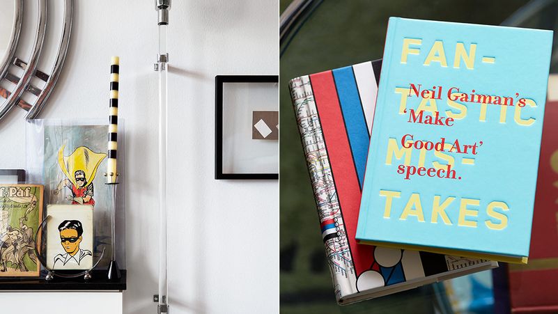
Mr Kidd’s nominated font is Blender, as seen (in pale yellow) on his design for Neil Gaiman’s Make Good Art
How do you know when you’ve really nailed it with a cover?
When it looks like a book I’d like to read, even if I don't know anything about it.
People tend to use the word “timeless” when talking about design. What does “timeless” mean to you?
Simply that something looks good after five years, 10, 20, 50, 100. Which hardly ever happens. That said, when I was researching my book GO to teach graphic design to kids, I rediscovered that the logo for Coca-Cola is pretty much unchanged since 1886.
What do you like about Blender?
I’ve been using it a lot over the past few years (and yes, I bought the license to it before doing so) because it has a classic sans-serif presence that feels fresh, due to almost undetectable quirks in the characters that have curved edges. On Make Good Art, it is the main element upon which the entire design hangs.
FIVE FONT FACTS
**1. ** Fonts are nothing new. Mr Johann Gutenberg, the German inventor of modern printing, created this beauty for his 42-line bible in 1496.
**2. ** A 2012 study by Mr Errol Morris revealed that people were more likely to agree with statements written in Baskerville than in Comic Sans or Helvetica.
3. The word “serif” refers to the small lines attached to the end strokes of a letter (for example, in Times New Roman). The first time a sans-serif font appeared in a type catalogue was 1816. It wasn’t well received.
4. The first font on the moon was Futura, which was used for plaques on the landing ladders for the Apollo missions.
**5. ** Director Mr Woody Allen’s favourite font is Windsor. According to The Guardian, he’s used it in 36 of his films.