THE JOURNAL

Photograph by Angel O’Donnell
Warm, sophisticated earthy shades comprise the most popular colour palette to incorporate into your space in 2025. In fact, Pantone’s Colour of the Year is mocha mousse, which is described as “a warming, brown hue imbued with richness… sophisticated, earthy elegance”. Below, interior designers share the benefits that earth tones bring to a home and their favourite ways to use them now.
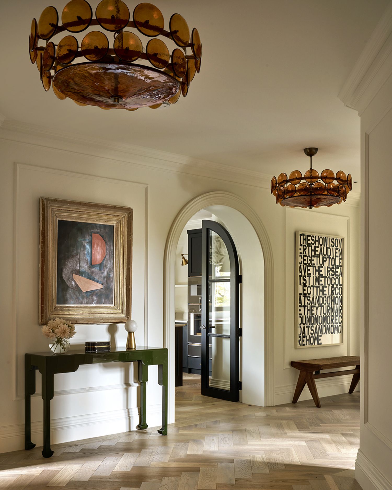
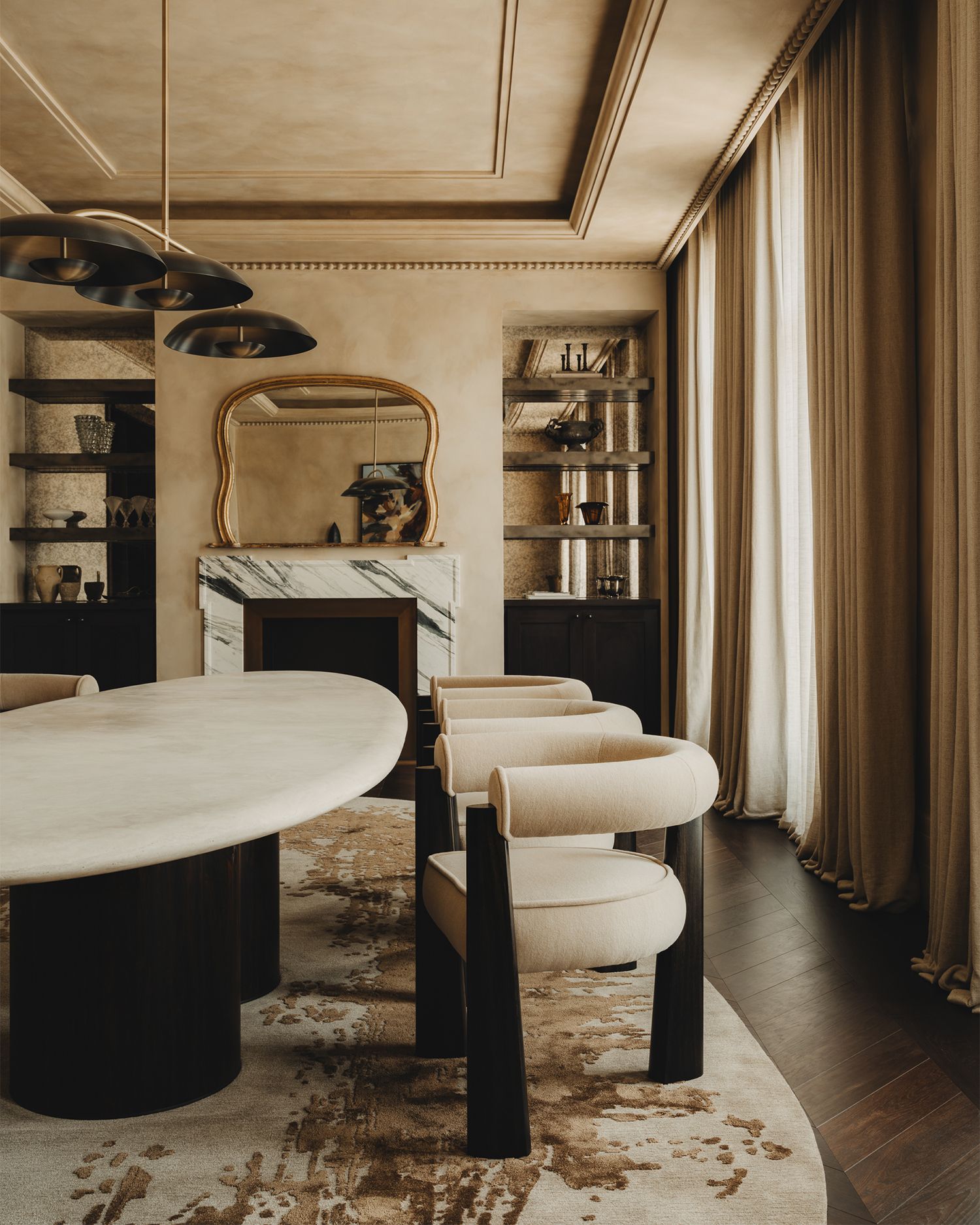
Photograph by Studio Vero/Simon Brown
Photograph by Studio Vero/Simon Brown
01. Get grounded
“Earth tones reflect our current desire for a feeling of grounding in interiors,” says Romanos Brihi, the co-founder of Studio Vero. “We work with these shades to create environments with quiet confidence and timelessness. They bring both comfort and sophistication to spaces in a way that feels effortless and refined.”
“We’ve seen a growing desire for spaces that feel grounding and authentic – a response, perhaps, to the overly digital, fast-paced world we live in,” says Edo Mapelli Mozzi, the founder of Banda. “Earth tones speak to that craving for calm. They carry a sense of permanence and warmth that instantly makes a space feel lived-in, rooted and quietly luxurious. These colours don’t shout, but they do resonate.”
Photograph by Christian Bense/Alexander James

Photograph by Christian Bense/Alexander James
02. Seek authentic materials
“I am a firm believer that one should achieve cohesion between both decorative and ‘fitted’ elements in a room,” says the interior designer Christian Bense. “Wood tones are a good way to incorporate these colours into a space – be it warm-tone wooden flooring or timber joinery. Artwork is also a great way of introducing these earth tones in a way which allows for a more editable approach.”
“We like to express this palette through rich wall finishes – like textured glass cloth wallpaper – noble timber and natural stone and veined marble,” Brihi says. “Accessories such as curated ceramics and textiles – currently I love burnt amber and terracotta for upholstery – can add depth without overwhelming the space.”
Photograph courtesy of BANDA
Photograph courtesy of BANDA
03. Think tone and texture
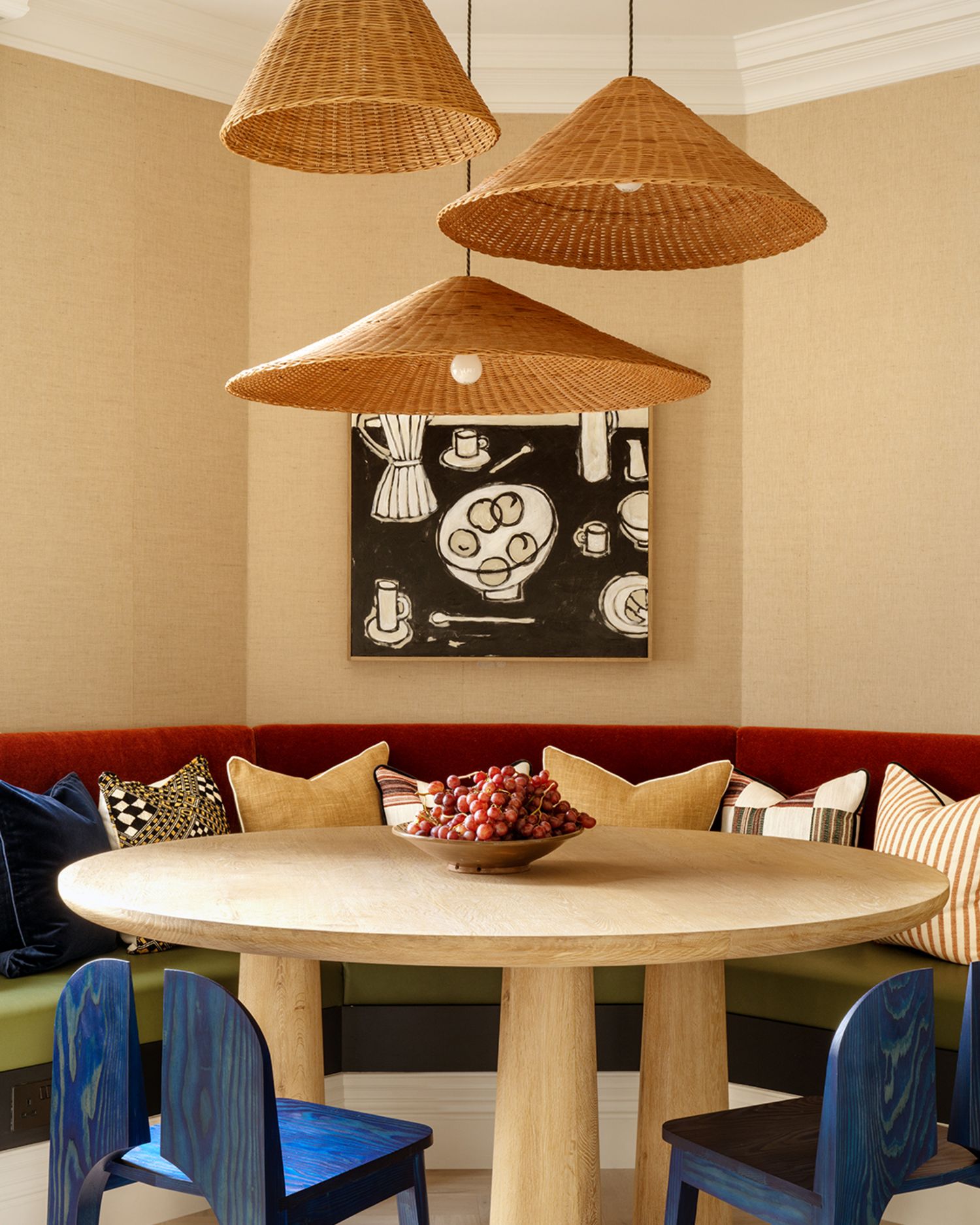
“We’re increasingly drawn to materials that feel raw yet refined,” Mapelli Mozzi says. “Chalky plasters that diffuse light with softness, unfinished reclaimed timber that adds depth and irregularity and stones like travertine, breccia or jura limestone with their naturally warm, layered character.
“We balance those neutrals with saturated clay tones, burnt sienna, terracotta and deep olive across upholstery and textiles to add weight and warmth. Accents in oxidised metals or aged bronze introduce a tactile, timeworn quality that evolves with the space. It’s not about decoration, but composition layering materials that speak to the natural world, while still holding a sense of restraint and sophistication.”
Photograph courtesy of De Rosee Sa
Photograph courtesy of De Rosee Sa
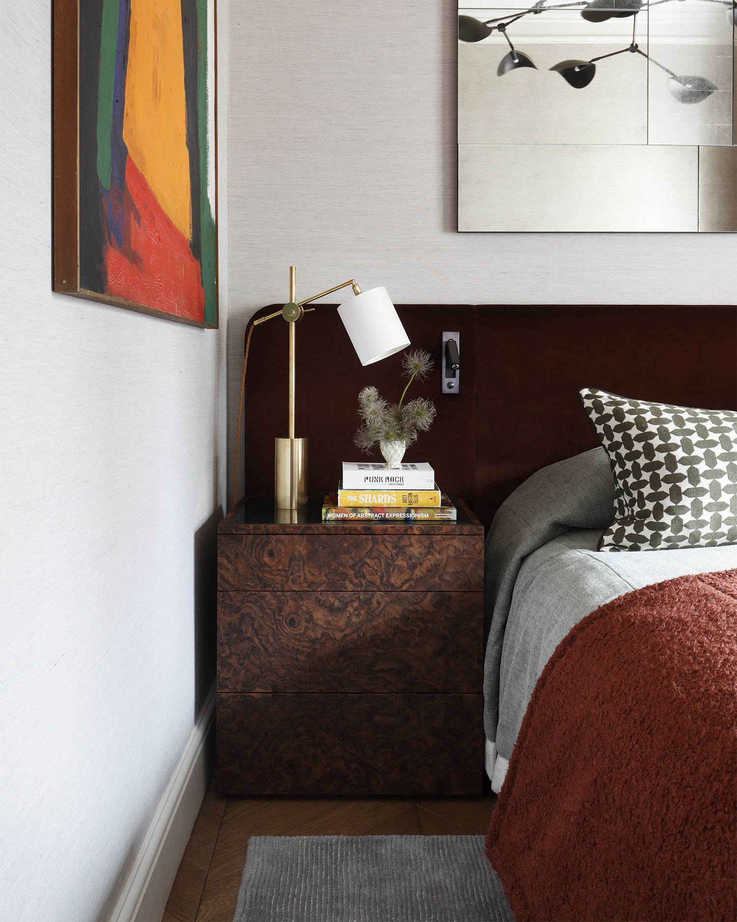
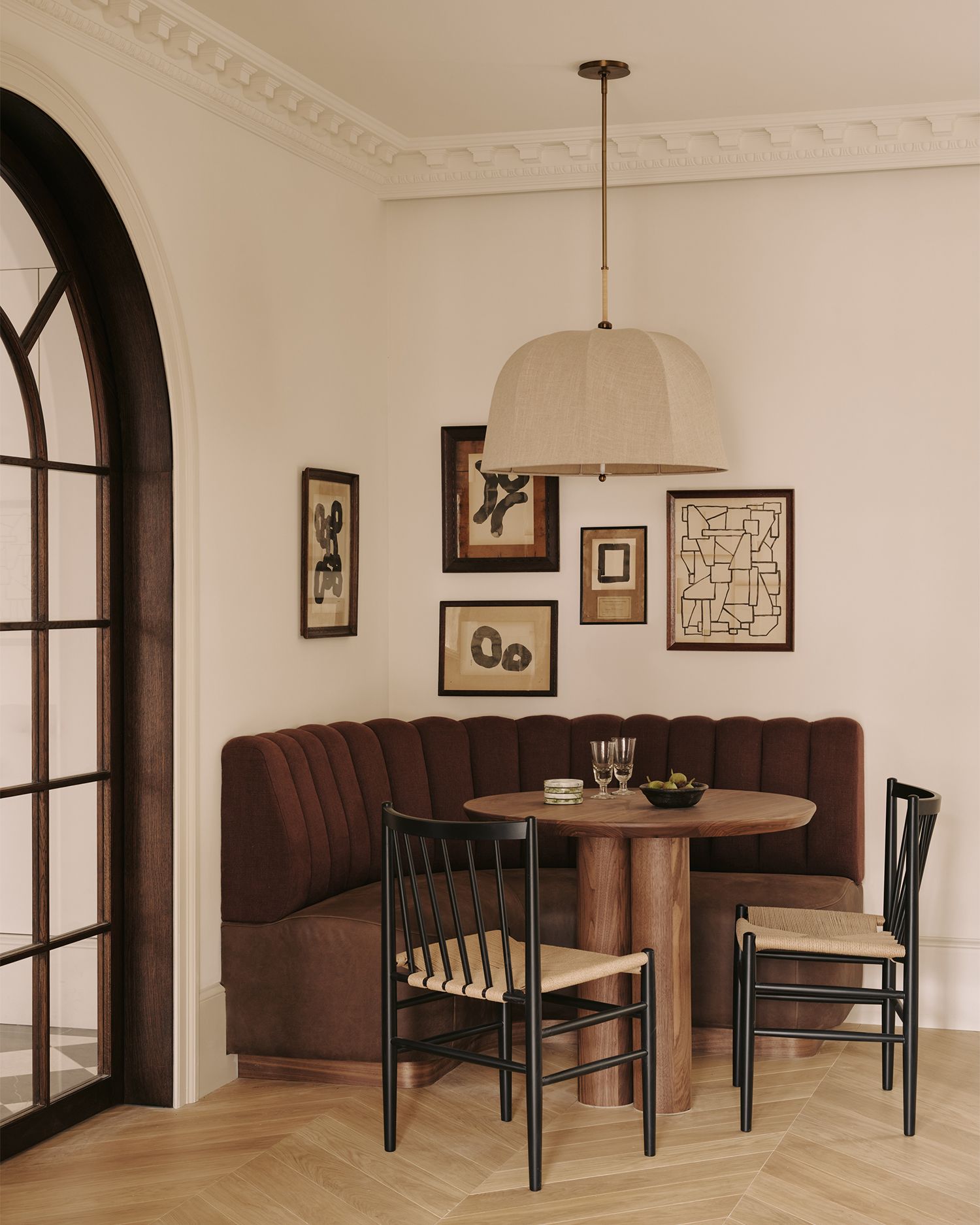
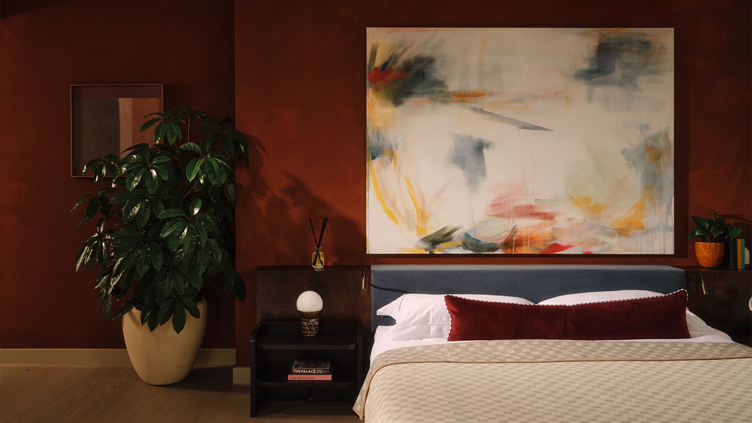
04. Make it intimate
“Earthy tones work particularly well in private spaces like the bedrooms, bathrooms and dressing spaces,” says Claire Sá, the director of De Rosee Sa. “These areas are used daily and it’s where you start and end your day, so it’s important that the colour palette is comforting and can withstand the test of time.”
“The shades really come into their own in more intimate, cocooning spaces,” Mapelli Mozzi says. “Cinema rooms, bar areas or a jewel-box powder room tucked away in a hallway. These are spaces designed less for function and more for feeling, where atmosphere matters more than light. There’s something inherently cinematic about these colours – the depth of ochres, the quiet weight of clay or the richness of umber tones. They create rooms that feel enveloping, with a certain hush to them moody, intriguing and just a little mysterious. We often use them to blur edges, soften corners and encourage stillness.”
Photograph by Christian Bense/Alexander James
05. Embrace the broadness
“These tones can work beautifully in both bedrooms and living spaces and are a great colour palette when wanting to ensure cohesion between rooms, without forcing you to match colours exactly,” Bense says. “There is quite a broad spectrum of earth tones, so separate rooms can still feel considered and cohesive without needing to be matching.”
06. Layer up
“[Using earth tones] can provide the perfect blank canvas for similar earthy shades, or as a springboard for layers of colour,” Sá says.
“You could start with a pale base palette and layer your earth colours – chestnuts, moss greens, mustard yellows and terracotta reds – in rugs, throws and cushions,” says Ed O’Donnell, the creative director of Angel O’Donnell. “Small, easy to manage accents. Or you could go all out and drench your walls and ceilings in a deep, nature-inspired pigment. It’s up to you, but if you’ve mostly lived with light neutrals, I’d go easy and build up the saturated tones bit by bit.”
Photograph by Angel O’Donnell
07. Enjoy their perennial power
“The appeal of earth tones lies in their perennial power,” O’Donnell says. “Warm and toasty in autumn and winter. Rich and lustrous in spring and summer. They never look out of place, so they keep spaces vibrant year-round.”