THE JOURNAL

The St Louis Cardinals at Busch Stadium in Missouri, August 2016. Photograph by Mr Dilip Vishwanat/Getty Images
Ahead of the new season, we round-up the big-hitters in the style stakes.
Thanks in large part to Gucci’s creative director Mr Alessandro Michele, whose luxuriously embroidered baseball jackets are among the season’s most coveted pieces, the sport’s oft-maligned uniform is enjoying a moment of style. And while we don’t imagine Mr Michele spends much time poring over box scores or weighing the pros and cons of the designated hitter rule, his unfailing eye is onto something: the logos, the lettering and even the physical structure of a professional baseball uniform has a certain functional elegance.
So as Major League Baseball warms up for its 117th season of play (beginning on 2 April), we’ve ranked our five big league favourites.
Detroit Tigers (home)

Mr Justin Verlander of the Detroit Tigers at Comerica Park in Detroit, Michigan, June 2016. Photograph by Mr Leon Halip/Getty Images
A century-old ode to simplicity, with subtle navy piping and an ornate olde English “D.” Like a navy suit, it flatters all wearers, whether a raucous firebrand like Mr Ty Cobb or a gentleman like Mr Hank Greenberg; whether a hefty slugger like Mr Cecil Fielder or an iron man pitcher like Mr Justin Verlander. (The last of which, as well as his lengthy list of accomplishments as a Tiger, is married to Ms Kate Upton.) We’re especially fond of the cap – so versatile that Mr Tom Selleck paired it with a Hawaiian shirt, a Rolex GMT Master and a resplendent moustache in Magnum PI.
Boston Red Sox (home)
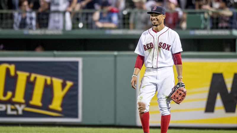
Mr Mookie Betts of the Boston Red Sox at Fenway Park in Boston, Massachusetts, September 2016. Photograph by Mr Billie Weiss/Boston Red Sox/Getty Images
Another uniform that’s essentially unchanged in the past century. The typography is wonderful, and the handsome bit of red piping on the front gives it a little New England flair. (It’s a shame they killed the piping on the ends of the sleeves, as seen in the iconic clip of Mr Carlton Fisk from the 1975 American League Championship Series, which even non-fans might remember from Good Will Hunting.) Fair warning: be mindful of going all-in on this look, lest you wind up looking like the Barstool Sports-loving “Massholes” skewered by Mr Jimmy Fallon on Saturday Night Live.
New York Yankees (home and road)
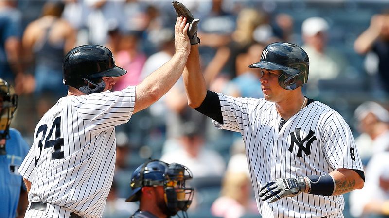
Messrs Gary Sanchez and Brian McCann of the New York Yankees at Yankee Stadium in the Bronx, New York City, August 2014. Photograph by Mr Rich Schultz/Getty Images
“You know why the Yankees always win?... ’cause the other teams can’t stop staring at those damn pinstripes.” So says Mr Christopher Walken in Catch Me If You Can, and he’s not wrong. The most successful franchise in baseball history certainly look the part, with an elegant style that radiates confidence. The team has worn the same uniforms – navy pinstripes on white at home, gray flannel on the road – since Mr Babe Ruth’s heyday. And unlike most franchises, the team doesn’t dilute its aesthetic with alternate or throwback jerseys.
Chicago White Sox (alternate jerseys)
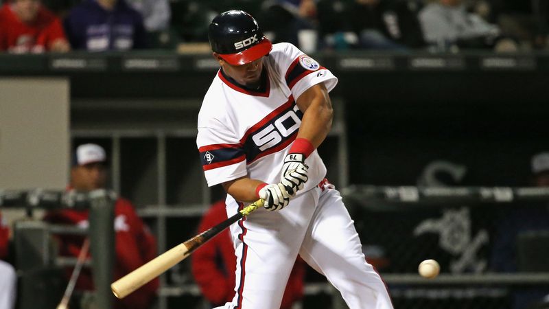
Mr José Abreu of the Chicago White Sox at US Cellular Field in Chicago, Illinois, May 2015. Photograph by Mr Jonathan Daniel/Getty Images
Like the Ferrari 308 or a DeLorean, this is an early-1980s design that felt futuristic when it debuted, quickly appeared misguided, then ultimately aged into a certain retro cool. The White Sox resurrected the look in 2014, and has since made it into a rotation staple. Given the team’s history – the so-called “Black Sox” threw the World Series in 1919, leading to a nearly century-long championship drought – it’s hard not to see the uniforms as a symbolic break with the past.
St Louis Cardinals (home and road)
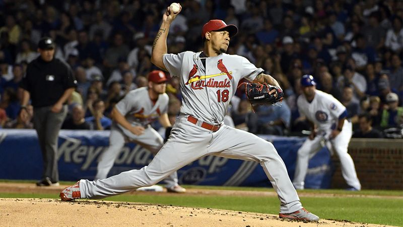
Mr Carlos Martinez of the St Louis Cardinals at Wrigley Field in Chicago, Illinois, September 2016. Photograph by Mr David Banks/Getty Images
If the Yankees are the Manchester United of baseball, then the Cardinals are surely the equivalent of Liverpool: both admired and hated for their success, with a certain piety that irritates all but diehard loyalists. And yet… that uniform. It’s truly timeless, one of a select few that hasn’t meaningfully changed for more than a century. The whimsical bird-on-bat logo has an undeniable charm, a living reminder that its wearers play a child’s game for a living. Mr Stan Musial, who manned leftfield for the Redbirds in the 1950s, was aptly described as baseball’s “perfect knight”. This iconic uniform was his armour.
BIG HITTERS
Keep up to date with The Daily by signing up to our weekly email roundup. Click here to update your email preferences