THE JOURNAL

Illustrations by Mr Nick Hardcastle
It’s not at all true to say that, when it comes to style, colour is inherently unmasculine. Were we living and breathing as recently as 200 years ago (fingers firmly pinched around nostrils, probably), we’d find that some of the most-admired male dressers of the day were stalking around in brightly coloured frock coats, embroidered in dazzling threads of rainbow hues.
In medieval times, when certain dyes such as purple were rather difficult to get hold of, wearing a bright colour meant you were rich and powerful – the equivalent of wearing a rare Rolex, or carrying an Hermès bag. Before that, we’re more open to speculation.
Ponder this: do you think they all wore navy to the Last Supper? Well, Mr Leonardo da Vinci certainly didn’t. In fact, the lack of vibrancy in the typical male wardrobe is a decidedly 20th-century invention. One that we can, if we’re generalising wildly, attribute to the homogeny of industrialisation, the rise of corporate culture and, as recently as the 1990s, the invention of a sleek, rigorous minimalism (thank you, Helmut Lang, Jil Sander and Prada) that brought 50 shades of grey to boardrooms everywhere long before the book of the same name appeared to devour our souls.
The point we’re trying to make here, perhaps a little long-windedly, is that colour in menswear has a historical pedigree. But it also has a bright future. Say what you like about trends such as “millennial pink” or the recent obsession with neon, one of the most intriguing things about these occurrences is that it wasn’t just the style hacks droning on about them. You saw it in everyday life.
At the other end of the funnel, when you look at recent collections from the most trend-setting designers from Balenciaga to AMIRI and everything in between, a bold use of colour is perhaps one of the few threads that ties everything together in this quasi-ironic and oddly discontinuous era of fashion history. The movement is wide-reaching: even august luxury houses such as Ermenegildo Zegna and Berluti are currently offering pieces in, let us say, outré shades. Colour is a large, and growing, part of almost every menswear collection.
It’s not all that surprising. The reality is that, as we enter a new era of working life in which remote working, freelancing and “disruptive” behaviour are looking like the new norm, our style aspirations will continue to diverge away from corporate conformity (part and parcel of the office-based 9-to-5) and towards studied, ingenious individuality. And colour is key to this: it’s a great way to make an impact.
Having said that, we’re still in a transition period. No one’s quite ready to go full Sesame Street just yet, so we’ll have to continue to mull over how best to work the new colours coming our way into our existing, reassuringly drab wardrobes. Which is why we at MR PORTER have put together the following guide, which aims to explain the not-so-complicated procedure of choosing, combining and carrying off colour in a way that will make people look, not stare.
01.
Use neutrals as a base for colours
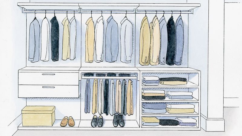
The starting point of wearing any colour is having the right shades to pair it with. Here is where we could start to go on about colour theory and the colour wheel, but seeing as you’re putting together an outfit, not decorating the Sistine Chapel, it seems a little unnecessary. Instead, we would like to introduce you to the concept of neutrals. That is, a set of low-contrast, malleable colours that will work with anything (as well as each other). This includes black, white and all greys in between. It also includes beige (but not so dark that it’s almost brown) and navy (but not so light that it’s royal blue).
By making sure you have a wide selection of items in these colours, you will have a far easier time introducing more standout shades alongside them. You will also have a ready-made wardrobe of things that can be thrown together willy-nilly and look more or less acceptable. And the best items to start your selection are the ones that themselves are thoroughly adaptable, namely T-shirts, shirts and trousers. As a starting point, we recommend browsing our very own range of Essentials. Even if you’re looking to get more colourful, such pieces really should form the backbone of your wardrobe.
Get the look

02.
Find the right colour for you
Every six months or so, the fashion world will come up with a selection of colours that are foisted particularly strongly on consumers. This is all very well for the sake of novelty, but the truth is not all colours suit everybody, and you shouldn’t wear a colour just because it happens to be on the rails at any given time.
Instead, figure out a range of colours that work for you, based on your skin tone, complexion, hair and eye colour. If you are pale, then very light and bright colours are going to make you look washed out and ghostly – it’s better to stick to deeper, richer shades. If you’ve got a deep tan or darker skin, you can get away with more vibrant hues, in greater quantities (though we would discourage you from mixing and matching lots at once – see below for more on this).
There are many more considerations here: yes, wearing something the same colour as your eyes will “bring them out” (just because your grandmother’s said it, doesn’t mean it’s not true) and yes, if you have a tendency towards redness in the face, you should stay from that side of the spectrum (lest the thing you “bring out” is more like a rash).
You could also take hair colour into consideration, or, if you have a prominent set of them, tattoos. Another important part of finding the colours that work for you is simply choosing the ones you like. If this isn’t obvious, lay your clothes out on the bed and take away the ones you never or seldom wear. Which colours predominate? Which ones make you happy?
Hopefully, by going through the above steps, you should arrive at a selection of colours you like and know you look good in. Lay them out next to each other and have a think. Is there anything missing? Could you add another colour that would fit in easily? Or one that would contrast very strongly? Hopefully, after some cogitation, you should arrive at a set of colours you’re comfortable with, ideally just three or four (you can expand these with so-called “tonal” shades, as we discuss below).
Having found your colours, bear them in mind when you’re shopping, as you would when decorating a room. An extreme way to do this is to create a physical (or digital) swatch you can carry around with you, or load up on phone. A more low-key method for those of you that can’t quite be bothered with all the Photoshopping and Pantone-ing is to just use your imagination. Either way, keeping in mind the colours you already have and wear when choosing new ones is always going to make for a more robust and interchangeable wardrobe.
Get the look
03.
Mix and match tonal colours
At MR PORTER, we’ve always asked our writers to avoid such decidedly fashion-y terms as “layering” and “tonal”. The idea being, you’d never say such things in the course of a normal human interaction, so why bother? But we’re going to break one of our own rules here and unpack “tonal” because, though not necessarily the most fascinating concept to chew over in the pub, it’s certainly useful to know about.
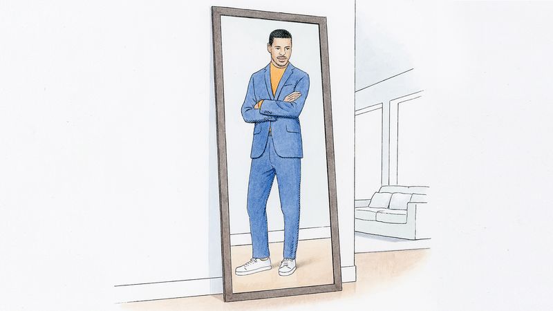
When fashion people say “tonal”, they tend to mean something along the lines of “two different shades of the same colour used together”. That is, if you wear a light-blue shirt under a darker-blue jacket, you might call it “tonal layering” (a sacrilegious collocation for us, if there ever was one).
The reason it’s a useful concept is that – and we hope this isn’t too obvious a point to make – tonal shades of the same colour go together pretty seamlessly. What’s more, mixing together different shades of the same colour makes the impact of the colour both subtler and richer. Where you might look like a children’s TV presenter if you wore a blue shirt with blue trousers in the same hue, wearing the same shirt with washed-out light-blue jeans and a navy Harrington jacket will look far more considered and adult.
You can take this approach quite far – four or five different tonal shades of the same colour can work in a single outfit – though it won’t leave you with much contrast. On that note…
Get the look
04.
Contrast your colours
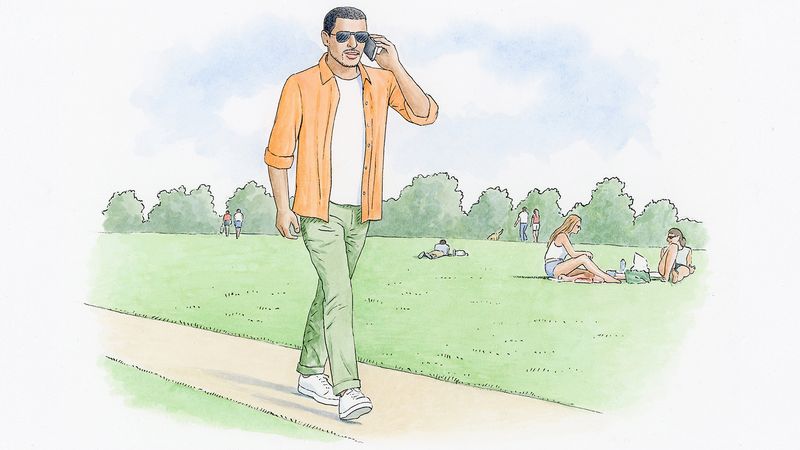
One of the sharpest ways to wear colour is by creating a contrast between two hues. The greater the distinction, the more you notice both, and the more complicated and assured the outfit will look. This contrast doesn’t have to be eye-popping or startling (though that can be effective). In fact it can be as subtle as, for example, pairing a navy blazer with a pair of light-grey trousers, or tan desert boots with some olive-coloured chinos. The important thing is that the eye clearly perceives two colours, and that they are in a harmonious balance.
To create such a contrast, we encourage choosing one shade as your main colour, and the other as a supplementary colour. A 50/50 split, like an all-over monochrome, has a bit of a blunt effect, much like a poster divided into halves. Instead, aim to let one colour predominate and add elements of the other colour as an accent. So, for example, you might wear a dark-green suit with a light-brown sweater and some brown brogues.
Even this approach is somewhat simplistic though. To get the most out of your colour contrasts, you should think of each of your main colours as an axis or spectrum, which can bend lighter or darker, meaning you can bring in some tonal shades of each colour to add variation to the whole. (NB: aside from white, neutrals count here. Beige is on a spectrum from white to brown. Grey from black to white. Navy from white to blue to black.)
If you know you’re going to be wearing a navy coat with an orange sweater, consider shoes in an orange-y brown or russet (to complement the orange), or a pale-blue striped shirt as opposed to white (to complement the navy). If you’re wearing a pale-pink shirt with your grey suit, you should be able to add a red pocket square or burgundy tie.
Of course, this is far from an exact science. You need to use your judgment of what looks good. But the two-colour plus tonal approach is a useful concept to go back to if you can’t work out what you might be missing colour-wise in your outfit (or, more importantly, what you might need to take away).
Finally, we should note that, of course, once you start working with more than two contrasting colours, things get a little complicated – and risky. Our general guideline on this front is that each new contrasting colour you add should have less prominence, lest all the colours start fighting against each other. But, to be honest, once you start mixing multiple different shades, you’re into a territory – much beloved by the likes of Mr Alessandro Michele at Gucci – in which personal flair and eccentricity should be your overriding guides.
Get the look
05.
How to change with the seasons
The one remaining thing to say about colour in style is that, as in nature, it changes with the seasons. This doesn’t mean you have to throw out what works for you personally just because the shelves are being restocked in the shops, or because one designer is strenuously pushing a particular hue. But it does mean you should subtly adjust your personal colour palette so your clothes are more able to cope with atmospheric conditions.
(There’s a reason people wear dark colours in winter and light in summer: the former absorb heat and light more easily, the latter reflect both. It’s not compulsory to follow suit but, for the sake of convenience and comfort, why wouldn’t you?)
The best way to adapt colour to seasonal changes is not to have two separate palettes for summer and winter, but to adapt your existing colour palette and, within it, change the emphasis of each colour. If you like wearing navy, red, brown and beige, then in spring you can wear more beige and brown, in winter more brown and navy. Consider also that many statement colours that are particularly eye-catching (and fun) in spring have variations that are more appealing in winter: scarlet can be exchanged for burgundy; bright blues and greens for teal; stone grey for slate. Certain neutrals (particularly navy, darker beiges and mid-greys) will work well in both halves of the year and so can be kept continually in rotation.