THE JOURNAL

Getting tired of wearing the same, boring old neutral tones? Sick of navy, white and grey? If your answer is yes, then you might wish to consider print. It’s a great way of introducing a splash of colour into your wardrobe – and it works particularly well during summer, when the warmer weather permits us to shed our outerwear and be a little more adventurous in the way we dress.
But where to start? As a general term, print encompasses everything from simple geometric patterns to depictions of fantastic beasts and exotic flora, the most obvious example of the latter being the iconic “aloha” shirt. And, while it doesn’t technically count as print, you could also add into the mix traditional weaving patterns such as houndstooth and herringbone, or garments that have been dyed or bleached to achieve an uneven finish. In other words, your options are near limitless.
And further complicating matters is the fact that print and pattern are not the easiest of things to pull off. Done right, they look great; but compared to neutrals, which all tend to go well with one another, there’s a much higher risk with print of missing the mark. And when you do, you’ll be drawing glances for all the wrong reasons.
There’s a fine line between vibrant and garish, between charming and kitsch; to help you stay on the right side of it this summer, our style editors have put together the following five-point guide.
01.
Bold geometric patterns
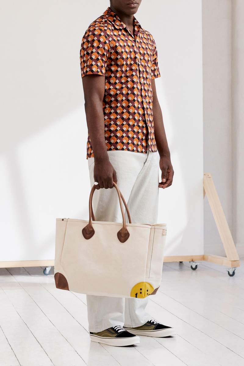
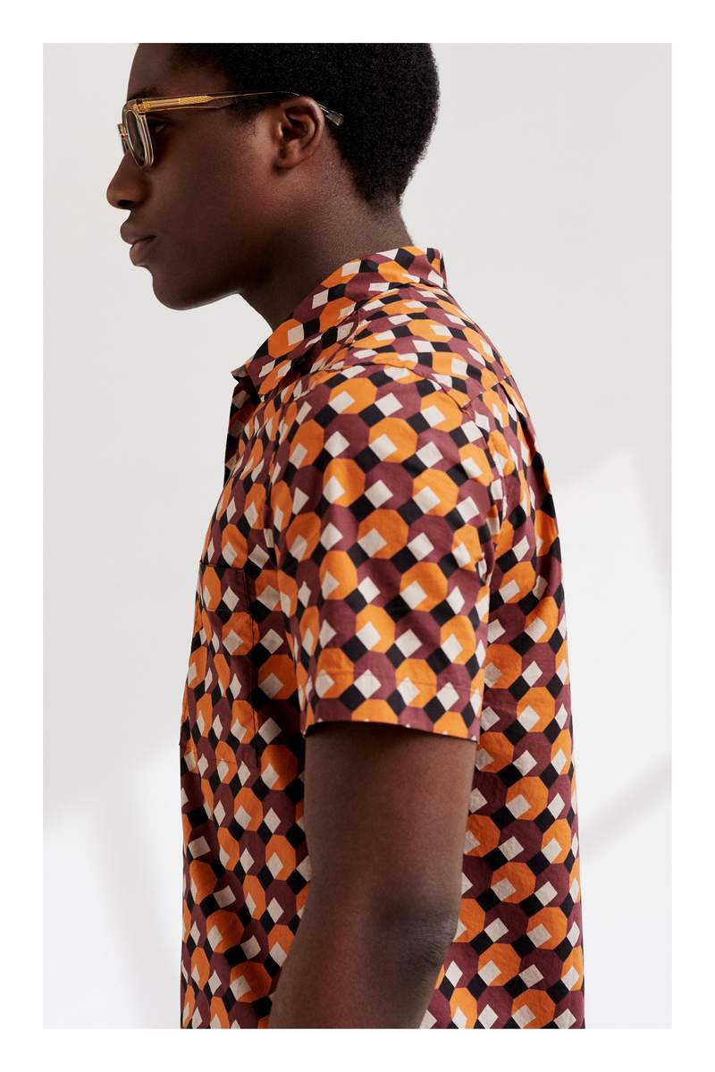
Everyone needs a jazzy shirt for summer, and this one, from MR PORTER’s in-house label Mr P., is close to the platonic ideal. Far smarter than a T-shirt, the short-sleeved shirt nonetheless remains an inherently casual garment: note the open collar and the high, straight hemline, which indicates that it’s designed to be worn untucked. As for the bold geometric pattern, it has a kind of London Overground upholstery feel to it, so do be careful that someone doesn’t try to sit on you while you’re on the commute. And, more pertinently, try to avoid wearing it with any other patterns. Prints like these need room to breathe. We’ve played it safe here and styled it with white jeans from Chimala, a small-batch denim manufacturer from Japan, a pair of Old Skool by Vans and a cream tote from KAPITAL’s recent smiley-inspired collection.
02.
Add a bandana
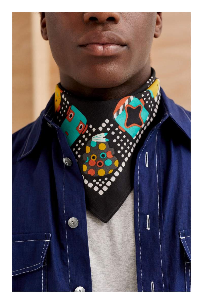
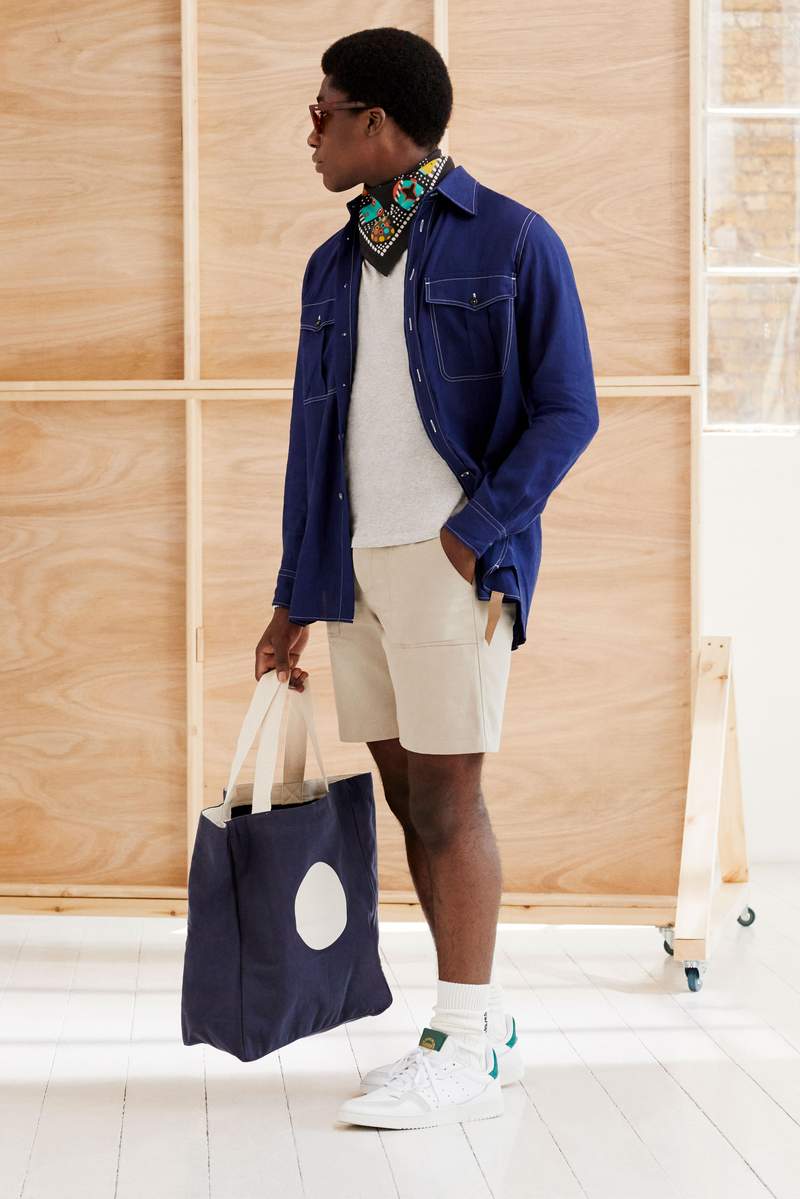
In many ways, accessories are the perfect vehicles for colour, pattern and print. Think of the tie, which has long served to brighten up the drab business suit; or of how a few colourful cushions can give your sofa a new lease of life. And the best thing about them is their versatility: you can take them off or change them out whenever you like. Here, a shot of colour is administered to this workwear-themed outfit by way of a bandana from KAPITAL. The bandana has been around forever, of course, and KAPITAL has been producing them for years, but it’s only recently that many of us have started wearing them, inspired to do so by their functional value as a rudimentary face mask. Pair this one with a printed tote bag from NN07 and you’re sure to be the best-dressed guy in the Whole Foods queue.
03.
Mix-and-match stripes
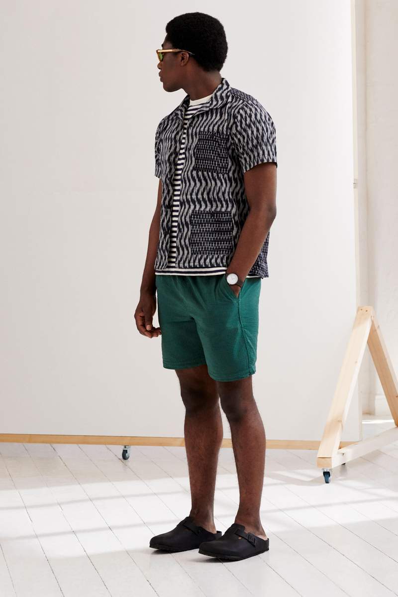
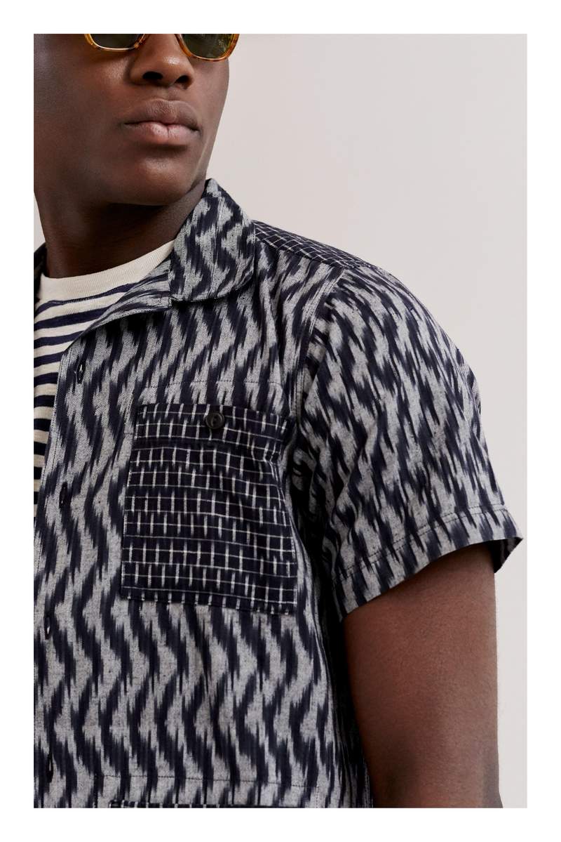
The art of pattern-on-pattern dressing is a tricky one to master. Tricky, but not impossible. First, and most importantly, you want the patterns to be easily distinguishable from one another, so as to avoid the jarring impression that they’re blending into one. There’s little chance of that happening here, as the sharply defined stripes of this Folk T-shirt are oriented at 90 degrees to the hazy stripes of this YMC shirt. Secondly, try to show a little restraint when it comes to colour. Two patterns in the same outfit are more than enough to keep the eye entertained; there’s simply no need to throw clashing colours into the mix, too. In this example, the navy/grey of the shirt and white/black of the shirt all fall within the same neutral colour wheel, with the bottle-green shorts offering a subtle contrast while remaining in keeping with the overall feel of the outfit.
04.
Houndstooth tailoring
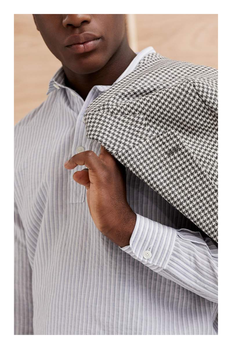
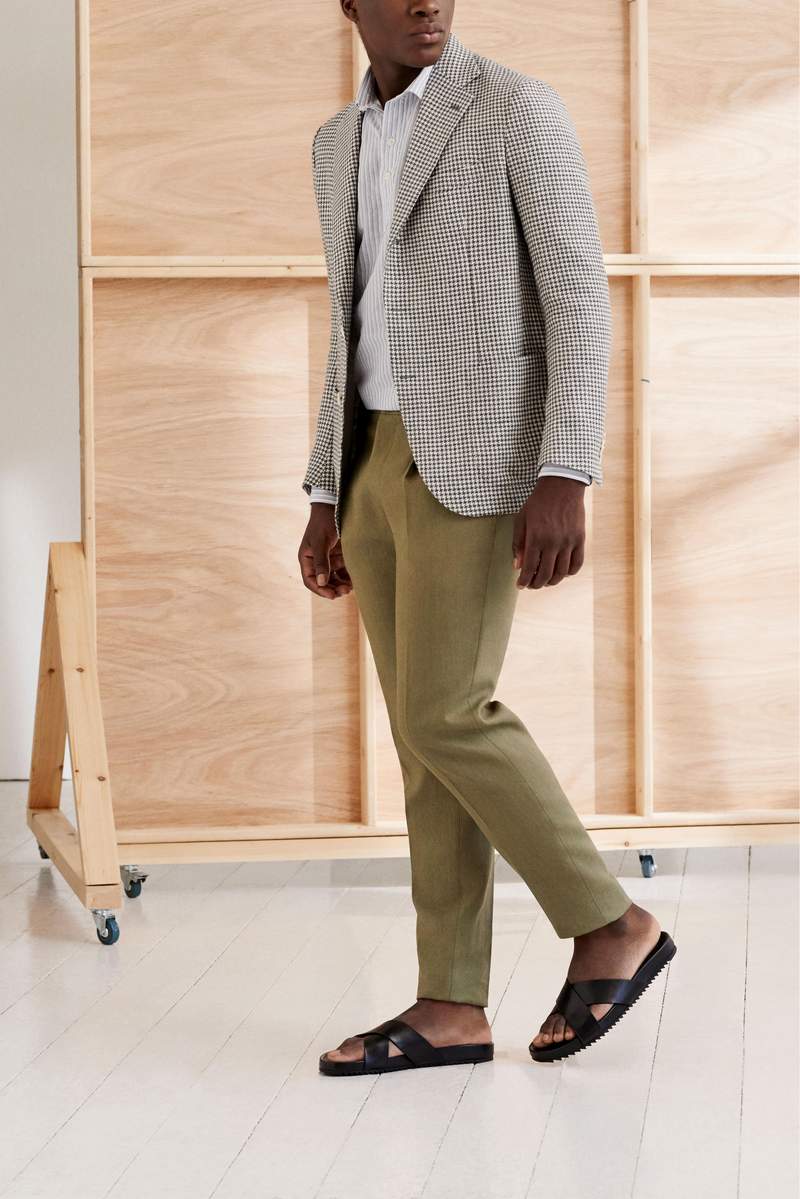
Print remains something of a foreign concept in the world of traditional tailoring, so we turn here to its analogue: the classic weaving patterns such as houndstooth, herringbone and Prince of Wales check. The first of these is on display here in this fine wool and linen-blend blazer from De Petrillo, a family-run Neapolitan tailoring label founded in 2006 by the effortlessly stylish Mr Benedetto De Petrillo. The great thing about introducing patterns like these into a tailored outfit is that you can be as subtle or as showy as you like. This blazer falls toward the former, but if you were hoping to make more of an impression you could easily opt for a bigger check in bolder colours. (One caveat is that you might have to shop at a different brand: De Petrillo doesn’t do flamboyance.) Completing this timeless summer outfit is a linen shirt and pleated trousers from another family-run Neapolitan tailoring label, the iconic Rubinacci. Note, as in our previous example, the way that the two patterns – the broken houndstooth check of the blazer and the vertical stripes of the shirt – are both easily distinguishable, while complementing each other in colour.
05.
Acid-wash coordinates
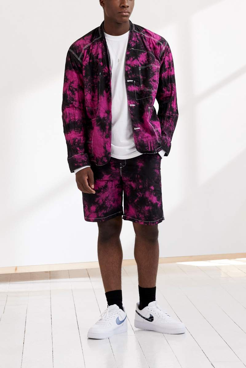
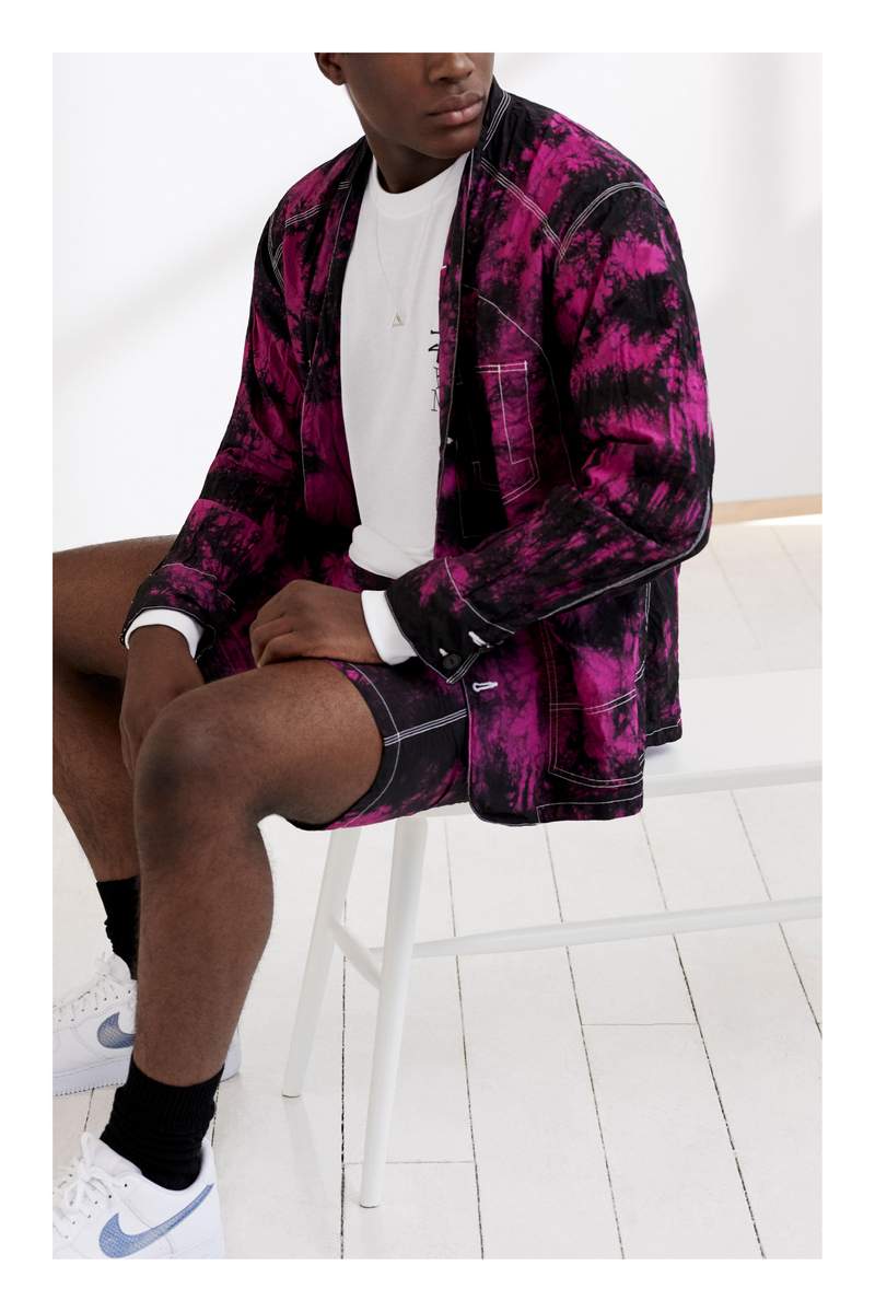
While not technically a “print” per se, the complex acid-wash and dyeing techniques employed by the cult Tokyo streetwear brand Sasquatchfabrix. have much the same effect, serving to break up swathes of flat colour and introduce vibrancy and texture into an outfit. Here, an acid-wash treatment is applied to a worker jacket and matching shorts for a purple-and-black finish that feels like a punkier version of tie-dye. It’s a Look, for sure, capital L and all; but if you’ve got the cojones to give it a try, we heartily suggest that you do. Just keep in mind the first and only commandment of print and pattern: Thou shalt not overdo it. All that’s needed to complete the look here is a white long-sleeved tee from Stüssy, a pair of white Nikes and some simple, unfussy accessories.